How making page issues more visible on Wikipedia mobile helps foster trust and participation
By Alex Hollender
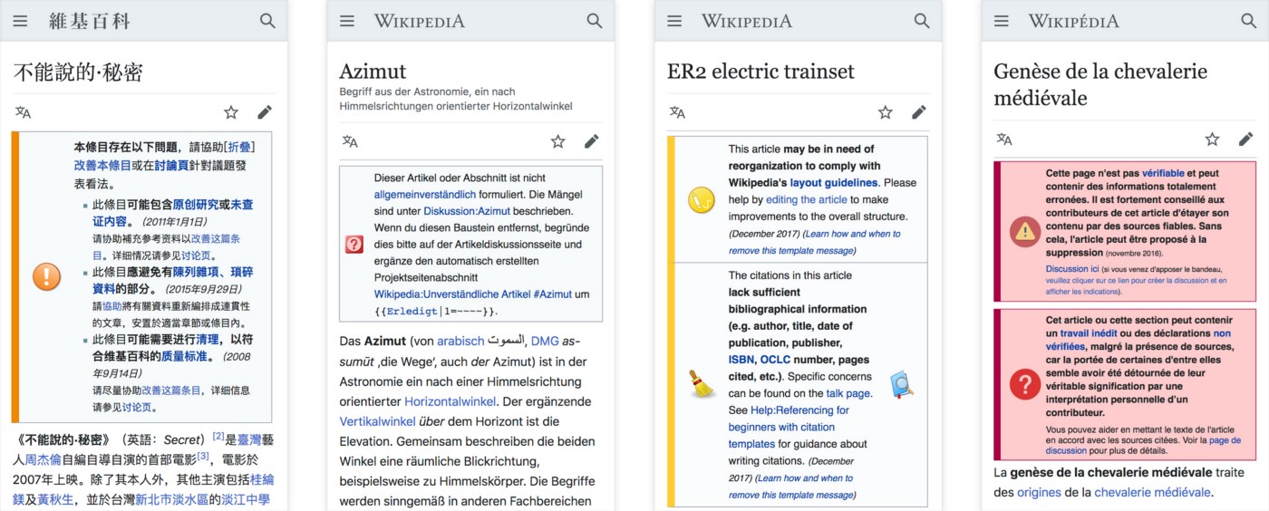
Today when reading a Wikipedia article on your phone you might see a notice at the top:
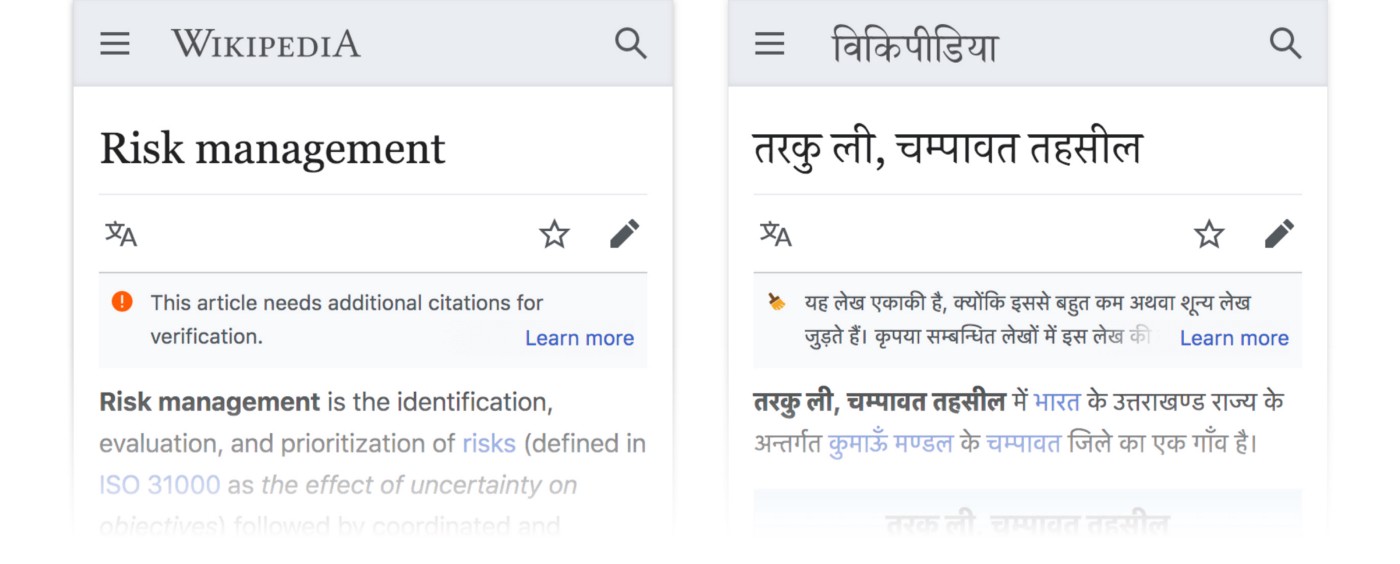
You might be more familiar with how they look on a computer:
We call these notices page issues, and 2018 we made them more visible on the mobile website. This blog post is about page issues: what they are, how they increase transparency, and our design process around increasing their visibility on mobile.
What are page issues? — Page issues let you know that there are unresolved issues with the article you’re reading. These issues range from the article not having sufficient citations, to the article not being neutral in its viewpoints, to the article having spelling and grammar mistakes. They usually do a good job of summarizing the issue, and then invite you to help fix it.
Page issues are manually added to articles by Wikipedia editors, and on English Wikipedia there are around 340 different kinds.
Page issues are inherently revealing. They are perhaps uncommonly honest. And they seem so unmistakably Wikipedian; I can’t quite imagine Facebook or Airbnb putting up such a notice — this isn’t quite right, help us fix it — on one of their pages. So before proceeding to some of the specifics about how we increased their visibility on mobile I want to think aloud about some general questions.
Imagine you’re trying to establish a website as a trustworthy source of information, why would you tell your audience that a certain page is sub-par, or lacking in some way? Could this bit of transparency actually help build trust with them? Maybe it shows them that you’re more interested in finding the knowledge together than you are as being perceived as already having the knowledge on your own. At the same time imagine you’re trying to facilitate collaboration between a huge number of volunteer encyclopedia editors. Might it be helpful if they could leave little notes and clues for each other on articles, helping direct attention and effort? Is there some bigger purpose page issues serve, beyond just giving people a heads up? Or in other words, are page issues symbolic of some larger truth or value within the Wikipedia community?
Trust through transparency — In 2007 David Weinberger gave a talk about his book “Everything is Miscellaneous” at Google. Forty-five minutes in he comments on page issues on Wikipedia:
“Wikipedia is very happy to have these notices stuck in…they encourage you to put up these notices saying this article isn’t good enough, don’t fully believe this article. And because of that we know that Wikipedia is on our side. [Wikipedia] becomes more credible because they’re willing to admit their lack of credibility, their lack of authority. It’s not trying to convince us that it’s the world’s greatest authority, it’s trying to help us know.”
His observation rang true to me. To reiterate and expand: because Wikipedia is more interested in having correct information than it is in being perceived as authoritative, it is able to be transparent about issues and shortcomings. Wikipedia is happy to show its hand, happy to let you know when something might be wrong, because it empowers you as a reader to be alert and discerning. This transparency also reminds readers that every Wikipedia page is a work in progress, and hopefully encourages them to get involved (which is where collaboration comes in).
Participation through (intimate?) transparency — Imagine that you walked into a coffee shop, sat down at a table, and on the table there was a note saying: Hello, we’re not entirely sure if this table works well here. How does it feel to you? Do you have enough space/privacy from the next table over? Do you think it’s annoying when people slide by to get to the bathroom? Please feel free to let us know your thoughts, or move the table elsewhere. This experiment will end next week. What would you think or do? How would that information and invitation change your relationship to that coffee shop?
I’m thinking of this note as a display of transparency. The coffee shop is being transparent about what it knows (or doesn’t know), and how it makes decisions. But the note is different from publishing an annual report, or some other kind of formal transparency statement. Instead it’s intimate, direct, and timely.
From what I’ve seen during my time as a Wikipedia community member, this kind of transparency, often in the form of handwritten signs (so to speak), guiding people’s attention towards what’s going on, what needs additional work, is a fundamental aspect of how and why people choose to participate. This transparency seems to inspire a spirit of independent participation. Which is to say that you’re empowered to fix things on your own, while also being supported by others if you need help. So I wonder if page issues function in this way; showing newcomers where help is needed and inviting them to jump in? They also seem to help experienced editors stay organized and direct energy appropriately. And in their humble, handwritten way maybe they reinforce the spirit of intimacy that is so necessary for a community-run project. Again these are questions, hopes, guesses; not a proven understanding of what’s happening. Now onto the more concrete stuff.
Increasing the visibility of page issues on mobile — Wikipedia community participation isn’t limited to writing and editing Wikipedia articles. The community is also involved with the planning, design, and development of Wikipedia as a website/piece of software. Just as anyone can edit, anyone can also voice their opinion about the functionality or look of the website and propose improvements, which is how page issues on mobile came to be prioritized.
In September, 2016 Wikipedian McGeddon posted on Village Pump (a Wikipedia discussion board):
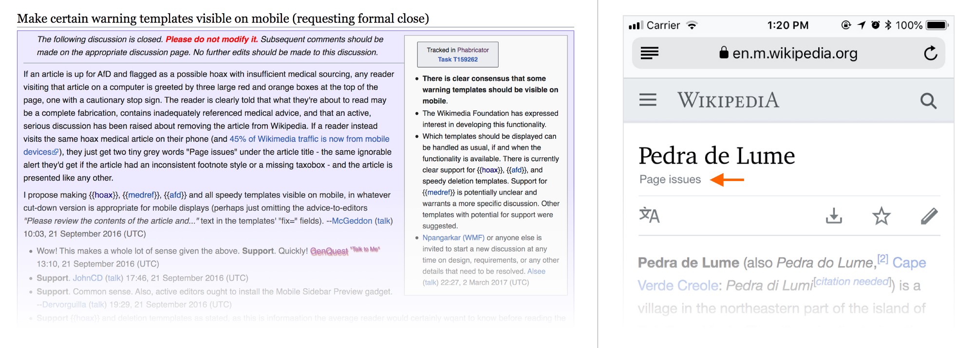
“If an article is up for [deletion] and flagged as a possible hoax with insufficient medical sourcing, any reader visiting that article on a computer is greeted by three large red and orange boxes at the top of the page, one with a cautionary stop sign… If a reader instead visits the same hoax medical article on their phone… they just get two tiny grey words “Page issues” under the article title…”
And while the fix wasn’t made until 2018, all in all it was a great demonstration of Wikipedia at its best — a community member voiced their question/opinion, a discussion began, and eventually an improvement to the site was made.
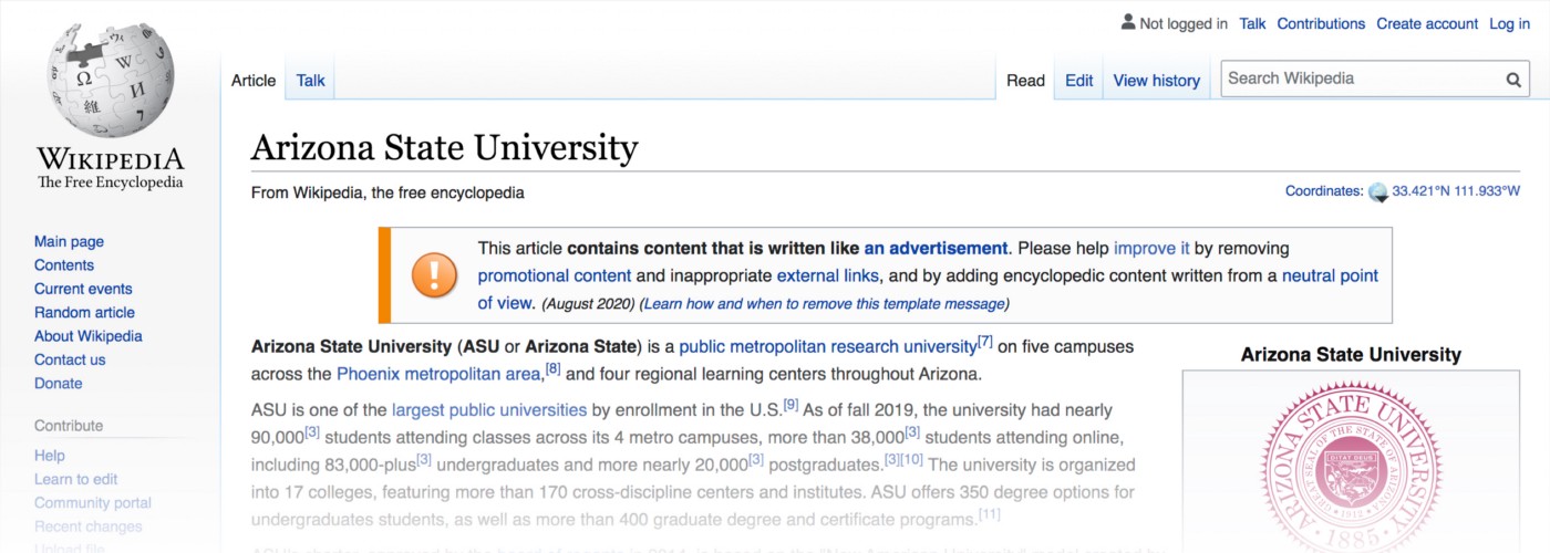
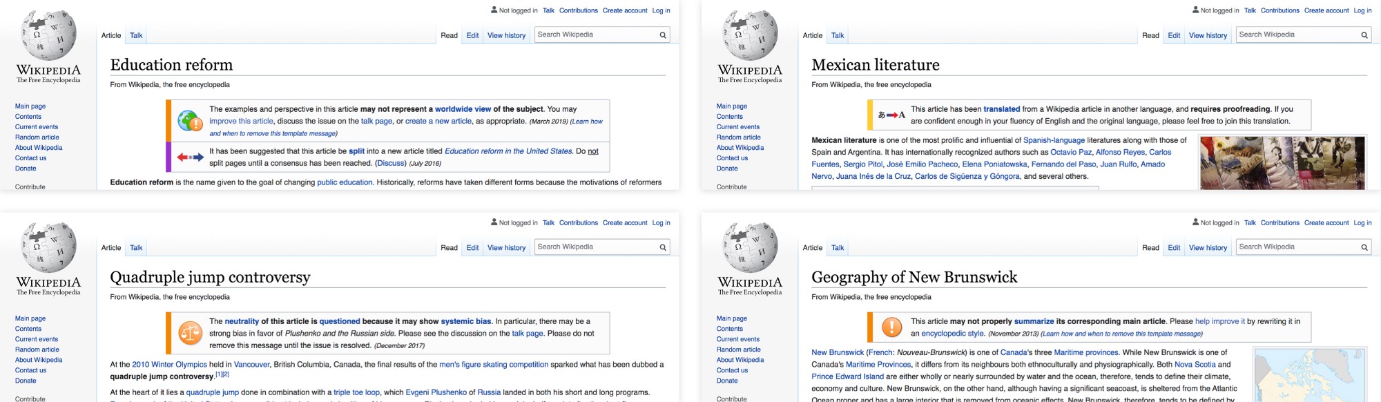
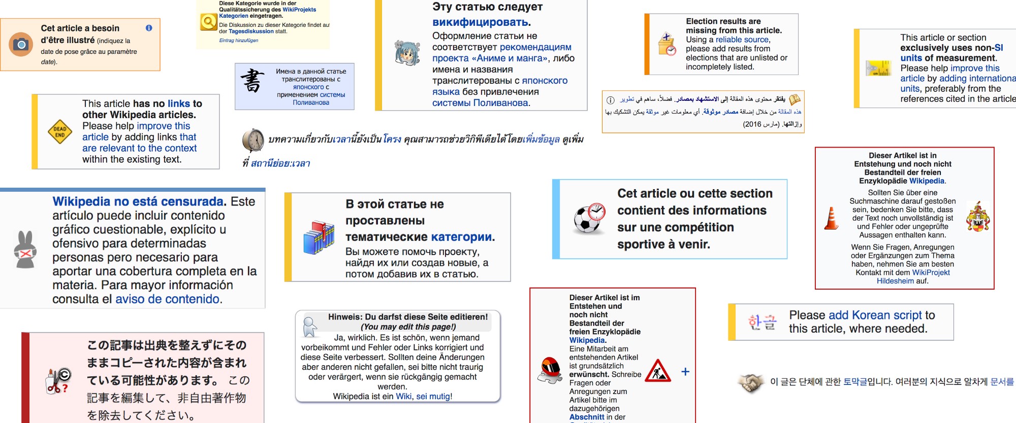
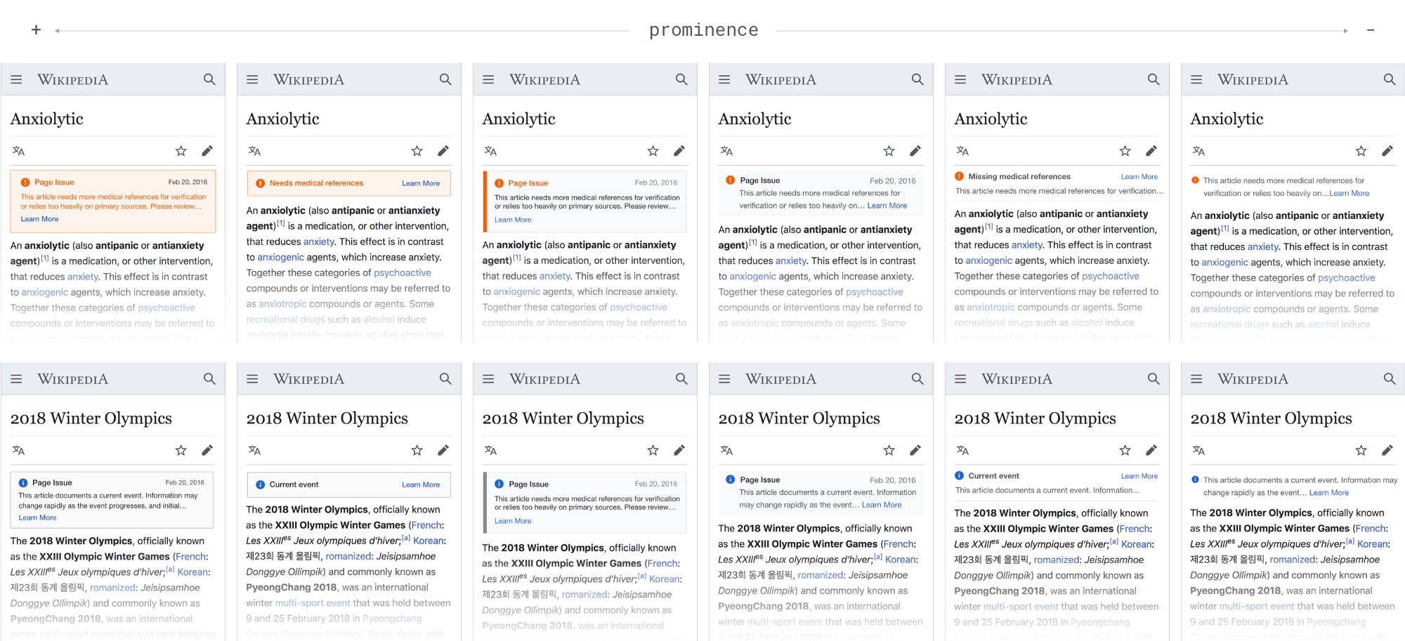
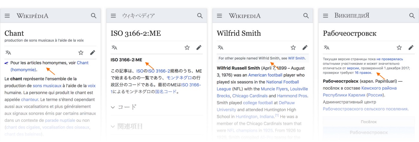
Design challenge — A page issue is like the note on the coffee table. They come in all shapes and sizes. They are not particularly standardized. Look at some of them, how much personality they have:
Our goal seemed relatively straightforward: show these page issues to people reading Wikipedia on their phones to make them aware of any known issues with the article they were reading. However if you try the straightforward thing, and just show them on the mobile website, you get this:
They don’t just automatically get smaller and look good on the mobile website. And to make matters worse, articles that have one issue often have others, so you get these boxes stacked on top of each other which pushes the article text way down the screen.
So how should they look on the mobile website? What’s the right balance between making them noticeable and them overwhelming the article? Keep in mind there aren’t just the 340 different page issues on English Wikipedia to test out, there are hundreds of others across various Wikipedia projects (e.g. French, Arabic, Thai, etc.). Some contain one image, some contain two or three. Many contain links to pages that also aren’t formatted to look good on a phone. We understood that we needed to come up with a systematic way of creating smaller, “mobile-friendly”, versions. To begin we identified that mostly all of them have: an icon/image, a text description, and a color. So it wasn’t too difficult to imagine the following:
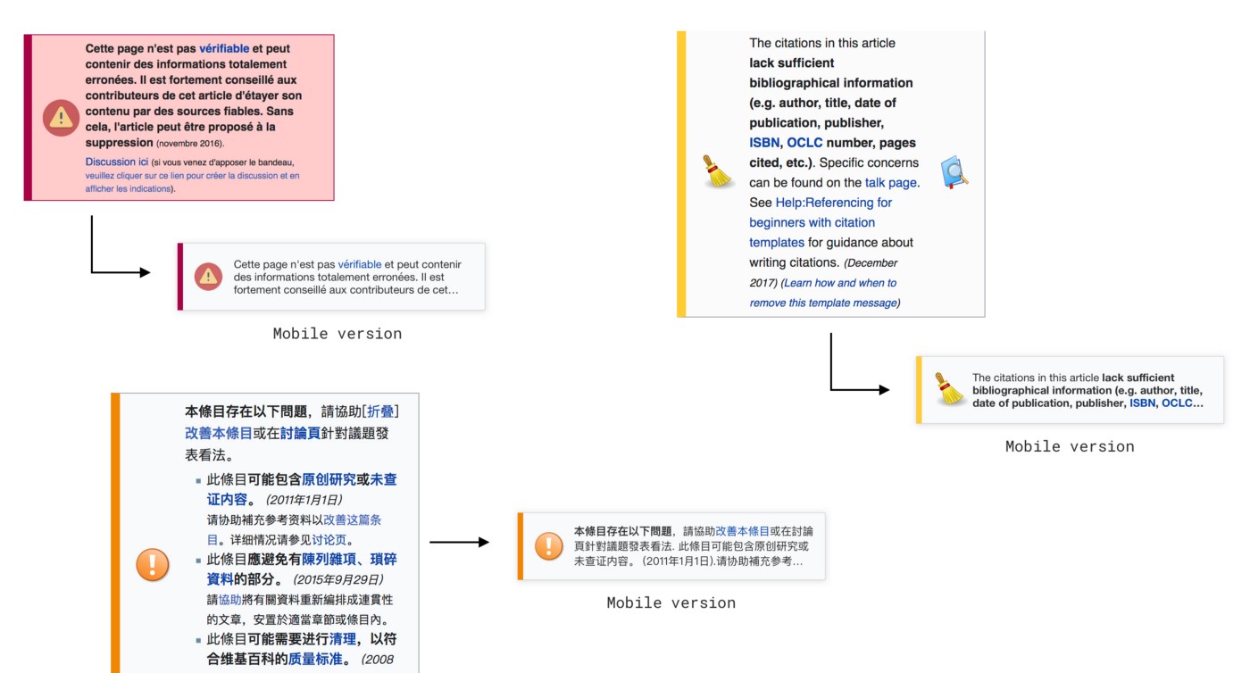
This is the type of visual consistency we were hoping to achieve. Since page issues aren’t standardized from a code/template perspective the technical challenge to isolate the relevant pieces (image, description, color/severity) was significant, though I won’t be getting into that here. A few other questions naturally occurred as well (partly curiosity, partly things that we thought might inform our design process):
- What are all the different page issues that exist? There was no straightforward way to get this information. This gallery shows page issues for some of the largest Wikipedias (thanks to Jan, an engineer on our team, who did this audit programmatically).
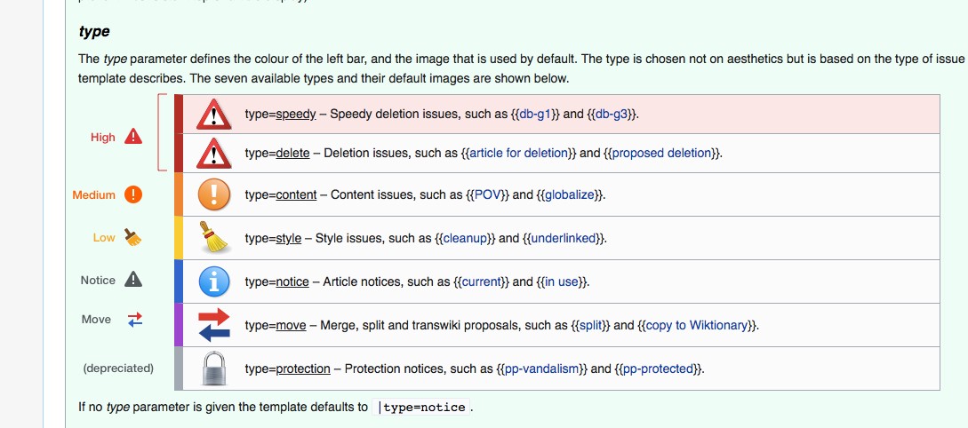
- Is there any structure or categorization to their level of importance? Thankfully yes, most page issues have a type parameter, which is a consistent way of programmatically knowing how severe a given issue is
- How common are the different types of page issues? Are there a small few that show up a disproportionately large percentage of the time? There was no straightforward way to get this information.
While we loved the personality of the custom icons/images many of them weren’t able to effectively communicate at a small size. We also hoped that using a simple visual system consistently across all page issues would make it easier for readers to quickly understand their importance. So we adopted the scale from English, using simplified versions of the icons:
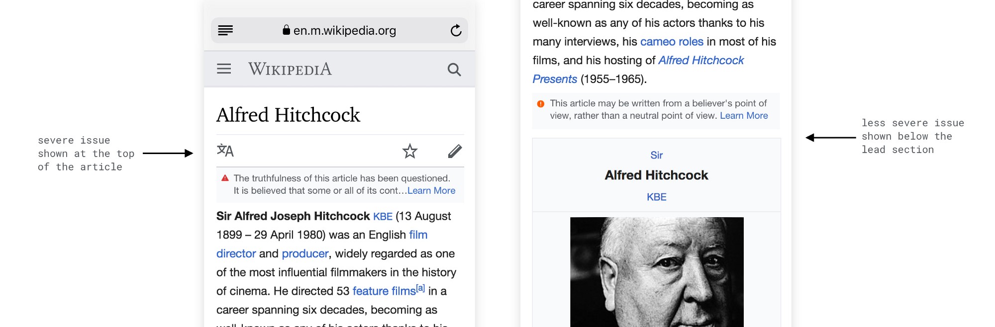
Our design criteria were also relatively simple: 1) people should see them (without them being distracting), 2) people should see the severe ones most easily, 3) the notices shouldn’t clash with other notices that appear at the top of the article.
We also questioned whether the placement on desktop — at the top of the article — was appropriate for mobile. We considered whether it might make sense to put important notices above the article, and less important ones perhaps below the first section. But we opted for simplicity here, and decided they should all just go in the same place.
At that point we felt like our solution was good enough to start testing. The main thing we wanted to learn from our test was: do people notice the page issues, and interact with them, more than before? This was the goal for the project and was admittedly a pretty low bar (considering that previously they were very understated). We also wondered about the secondary effects of exposure to page issues. Would exposing page issues on mobile affect trust and/or participation in Wikipedia, even for people reading from their phones? Here is what we found:
- On the main goal we succeeded: the new page issues were noticed and interacted with significantly more than the old ones. And furthermore, more severe issues are noticed and interacted with significantly more than less severe ones
- On the secondary goals the outcome was less clear: we saw no immediate increase in editing as a result of the updated treatment, and we didn’t end up measuring trust.
- You can view the full report here
And so we labor on, continually trying to bring transparency to every corner of our experience. The more people know about the information they are reading the better equipped they are to be discerning. We believe that transparency has value in and of itself, and this project was about furthering that value. We didn’t see an immediate increase in editing, but we also know that editing from a mobile is more difficult to begin with, and we are still continuing to learn about the different mentalities different people have when reading Wikipedia on their mobile device versus on a computer. In other words, we’re far from finished yet. But now people reading on their phones will see the notices, and over time more of them may be inspired to participate.