By David A. M. Goldberg with Pau Giner
The Wikimedia Foundation [WMF] has established the ambitious vision of making the sum of the world’s knowledge accessible to all the world’s people, by 2030. This vision necessitates a focus on scale: how to scale up content production, globally, and how to scale up access to this content in emerging contexts. Behind this need to scale is a critical design challenge: how to ensure a useful, usable and consistent reading experience while enabling rapid growth. To meet this challenge, WMF’s small but mighty Product Design team has developed a set of best practices and guidelines for product development across all of the Wikimedia Projects. This Design Style Guide, the first of its kind since the founding of Wikipedia in 2001, is both a means of maintaining consistency while scaling, and also a key contribution that product design is uniquely positioned to make – in the Free Knowledge Movement, and across Wikimedia projects.
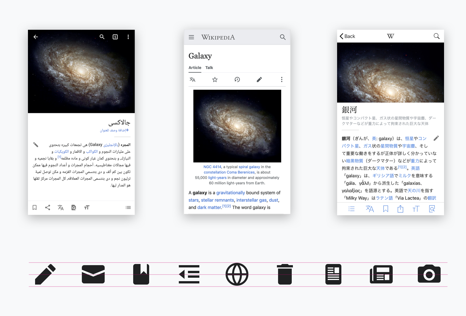
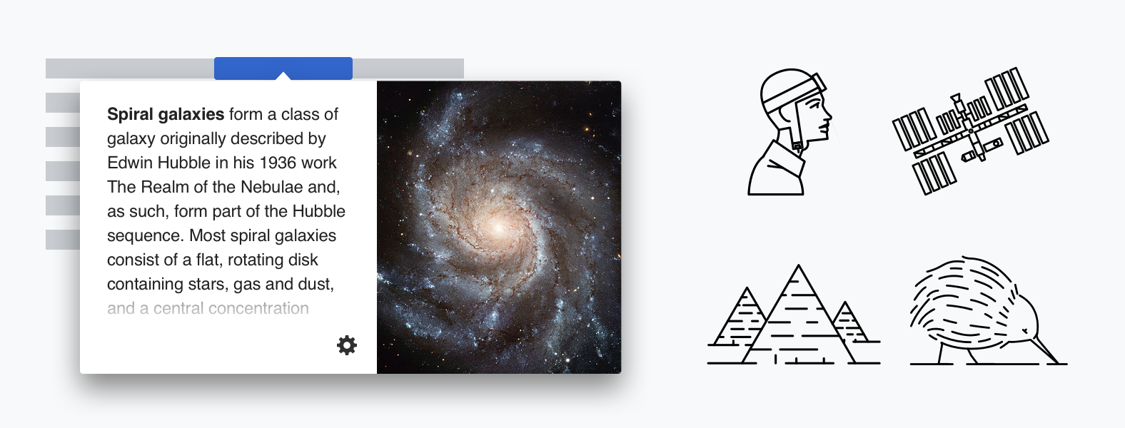
The focus of the Guide is to translate the core values of the Foundation into a language of design: this is for everyone, content has priority, usability guides aesthetics, and there is joy to be discovered in honest, open, and free communication. These values are not just idealizations, they are concretely expressed in the Design Team’s comprehensive suite of user interface visual elements (available for download and use) and Wikimedia’s evolving Object Oriented User Interface (OOUI) JavaScript library that puts them to use. Taken together, the WMF Design Team has created a spectrum of engagement that includes those who want to see better-looking, more accessible and consistent design across Wikimedia projects (or the Web at large!), and folks who want to work with free design and interface-development resources. Even if you have never reflected on the effort that goes into creating the best user experiences—we take icons and UI components for granted until they break or confuse us—it is worth casually exploring these resources to get a sense of exactly how the Web can and should work.
The scope and reach of the Design Team’s web UX conventions puts the Foundation in the company of other free, standards-based, and open source initiatives like the United States Web Design System, and the UIKit project, and in the same class as influential commercial giants like Apple, Facebook, and Google. However, unlike the design requirements of the governmental public sector, or multinational for-profit corporations, the Design Style is informed by the unique challenges associated with the heterogeneity that exists at all levels of large-scale, global, volunteer-driven projects.
I asked Pau Giner, one of the Design Team’s leads, how they negotiated a balance between the technical rigors of modern UX design, its pleasure principles (design is, after all, about a goodness), and inviting the participation of communities who do not take the first two actors for granted. This would include people who are new to working with Wikimedia projects, and designers who have never seen their expertise and insights play a part in pursuing the Foundation’s mission. One cannot design a comprehensive design standard by consensus, via self-organized volunteerism, or in direct response to every individual need. He provided an urban metaphor, contrasting the smaller winding streets of older cities like Barcelona (the utopian), with the regular and presumably more practical grids of Chicago or New York. I believe that part of Giner’s intent was to give a sense of what it would be like to introduce necessarily binding rules into a system that had developed in a largely organic fashion, but his metaphor goes further.
Compared to Google’s Material Design, he describes the WMF Design Style Guide and its supporting resources as less “complete.” For now, it lacks Material’s formal guidelines for approaches to media, motion, and visual density for example, but according to Giner’s urban metaphor, a totalizing approach to all possible modalities of design would run counter to the bespoke intricacies developed during the lifetime of a collaborative project like Wikipedia. That said, some of what is considered “charming” about the plans of very old cities is a record of old solutions remaining in service long after their original problems were solved. This creates some interesting tensions that the Design Team has tried to resolve through an open and flexible approach rather than a fixed set of top-down “universal” standards that demand adherence.
Giner describes the team’s approach as co-evolutionary in the sense that it works closely with various Wikimedia communities that are already deeply invested, both conceptually and technically, in their tools and approaches to content. Working across a number of time zones and specialties, using hackathons and project management tools, the Design Team has collaborated with Wikimedians like Samantha Nguyen (Brickipedia), Nislihan Turan (volunteer on the Android Commons app), and numerous internal and cross-Foundation folks. Their contributions ranged from feedback to specifications design, to coordination and connecting normally separated communities such as designers and developers. Giner has also seen increased usage of the Style Guide among new Wikimedia editors and readers, coming—importantly—from non-English speaking communities all over the world.
As a Wikimedia project itself, the Style Guide serves as a kind of global ambassador, presenting itself to other communities as a demonstration of its own standards, and offering its own DNA, so to speak, as a solution. Communities with great passion and expertise in their field of knowledge, but varying levels of design and technical literacy, work transparently and collaboratively with Giner and his peers to pose and answer questions. This iterative responds to new questions that are raised, and avoids infinite regression, unilateral appeals to expertise, and the blandness of design-by-committee. The argument for a unified—but not necessarily comprehensive—design is not forced, but developed from the inside out, and guided by a respect for the specificity and diversity in communication that underlies the Foundation’s mission to make all of human knowledge available to everyone, without relying on any given human’s exclusive perspective. The Wikimedia Design Team’s particular alignment with the mission makes it real in that special way that steering wheels, doorknobs, light switches, and traffic signs simultaneously tell us what to do, and how things can be done, in a system where individuals are ultimately responsible for their own actions.