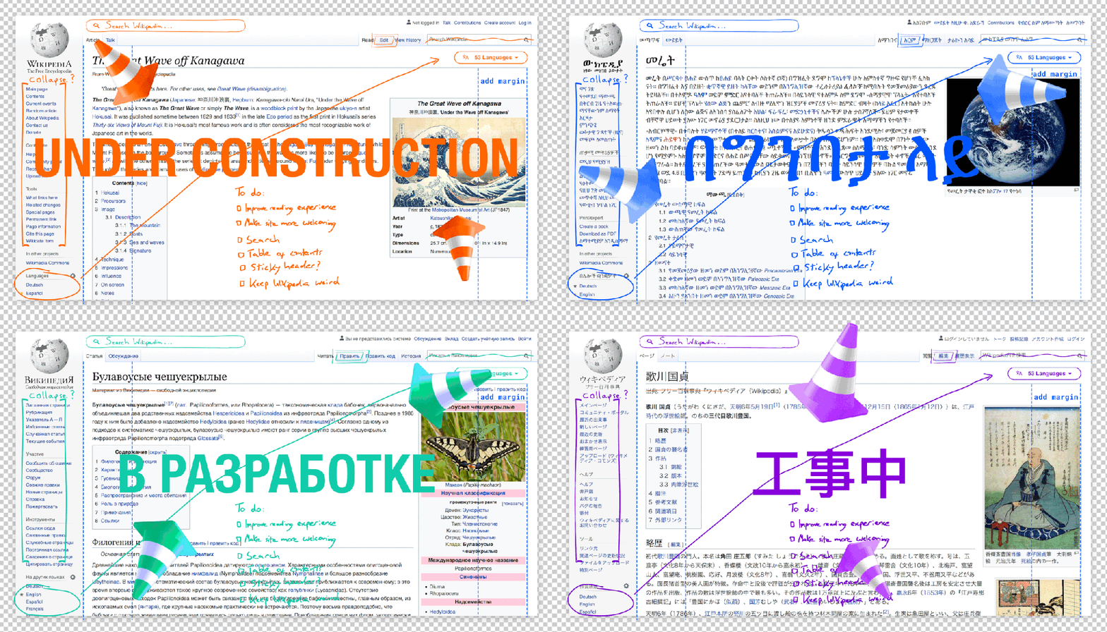
By Olga Vasileva
Wikipedia has remained a critical and widely-used resource for knowledge across the world for the past two decades. Over this time, the site has expanded significantly to contain unparalleled amounts of reliable and thorough information, including 53 million articles across over 300 languages. While Wikipedia’s content has grown rapidly, our interface has not kept pace. We’re proud that our website is more direct, simple, and advertisement-free than the rest of the internet. Yet, the design of desktop Wikipedia and other Wikimedia Foundation projects have not seen any substantive changes for the past 10 years, leaving certain elements of the site’s navigation feeling clunky and overwhelming to readers and editors whose main purpose is to create, learn, and curate content.
The desktop design is particularly important to new users who have come to the internet for the first time over the last decade. To these users, much of the wide range of functionality on the site can feel overwhelming and difficult to understand. In order to welcome them to our projects and entice them to come back, we need to provide not only excellent content and an experience that is engaging and easy to use, but also an experience that is on-par with their perceptions of a modern, trustworthy, and welcoming site. At the same time, we wish to keep the core of our identity and evolve in a way such that the final product indisputably looks and feels like a Wikimedia project. We want to create an experience that feels similar to our long-time users, yet straightforward and intuitive for new folks.
It is with these goals in mind that the Wikimedia Foundation began a multi-year project to improve Wikipedia’s desktop. Since May 2019, we have been working to strengthen the Wikipedia desktop interface — focusing on bringing our content to the forefront, and making the site easier to navigate. Our goal is to create a more welcoming experience for all who come to our projects, regardless of background or level of experience with Wikimedia sites.
Forthcoming changes to the desktop include a reconfigured logo, collapsible sidebar, table of contents, and more! You can see the full list of new features on MediaWiki. These changes will happen incrementally over a long period of time, to allow for ample user testing and feedback. If all goes to plan, these improvements will be the default on all wikis by the end of 2021, timed with Wikipedia’s 20th birthday celebrations.
Recently, we deployed the first of many changes to a set of early adopter projects: Basque Wikipedia, Farsi Wikipedia, French Wikipedia, Hebrew Wikipedia, French Wiktionary, and Portuguese Wikiversity. Users with accounts on other projects can also view these changes by selecting the latest version of the Vector skin within their user preferences.
Our first change, a collapsible sidebar, allows users to collapse the lengthy menu found on the left side of each page. This change helps improve usability and focus by allowing people to concentrate on the content itself, whether reading or editing.
Our second change introduces a maximum line width to our content on pages where reading is the focus, such as article pages and discussion pages. Research has shown that limiting the width can lead to better retention of the content itself, as well as a decrease in eye strain.
These are the first of many changes in a long and complex process. There will be bugs, adjustments, and iterations. We welcome anyone curious about our changes to try them out and give us feedback. Have additional questions about the desktop improvement project? See answers to some of our most frequently asked questions on MediaWiki.
