By Robin Schoenbaechler & Jazmin Tanner
Over the past year, the Wikimedia Foundation Android team has focused on improving the communications experience in the Wikipedia Android app. Asynchronous collaboration is a core component of the Wikipedia editing experience, and the lower the entry barrier to editing, the more diverse the content will be for our 14 projects across 300 languages. This diversity of content and collaborators is core to the movement strategy, which focuses on knowledge equity and knowledge as a service. The movement strategy brings us closer to ensuring our projects represent the sum of all knowledge.
As the organization focuses on knowledge equity, the Product and Technology departments have worked on a framework for inclusive product development. To ensure the framework was reflective of the varying scope and team composition of our development teams, seven Wikimedia Foundation teams signed up to test the playbook and provide feedback. The feedback would serve as an input for V2 of the playbook in our framework. With our team’s goal of reducing the barrier to communication and collaboration in the Wikipedia Android app and being very intentional about accessibility, we were a logical test team for the playbook. We also recognized there would be a lot to balance as we worked towards this goal.
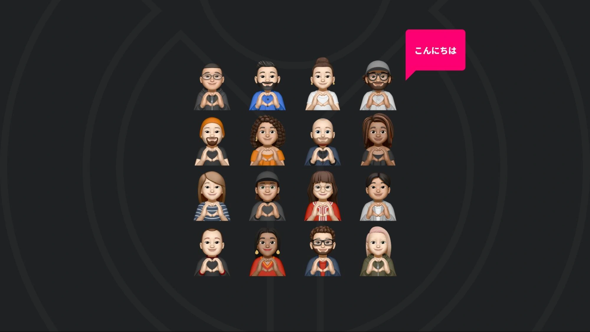
Although the original request to improve communications in the apps came from experienced members of our community that largely wrote in English, we wanted to be very intentional about partnering with members of the community who haven’t been historically centered in our projects. Depending on the development team and platform the partner communities could look different. In our context, the identified partner community members consisted of women and non-binary editors on Japanese Wikipedia, French and Arabic editors in Mali, Egypt, Morocco, and DR Congo, Hindi and Indonesian Wikipedia editors, English Wikipedia editors in Nigeria and visually impaired English Wikipedia editors in India. You can read more about our process in selecting these partner communities here.
The egg-laying wool-milk-pig for Android
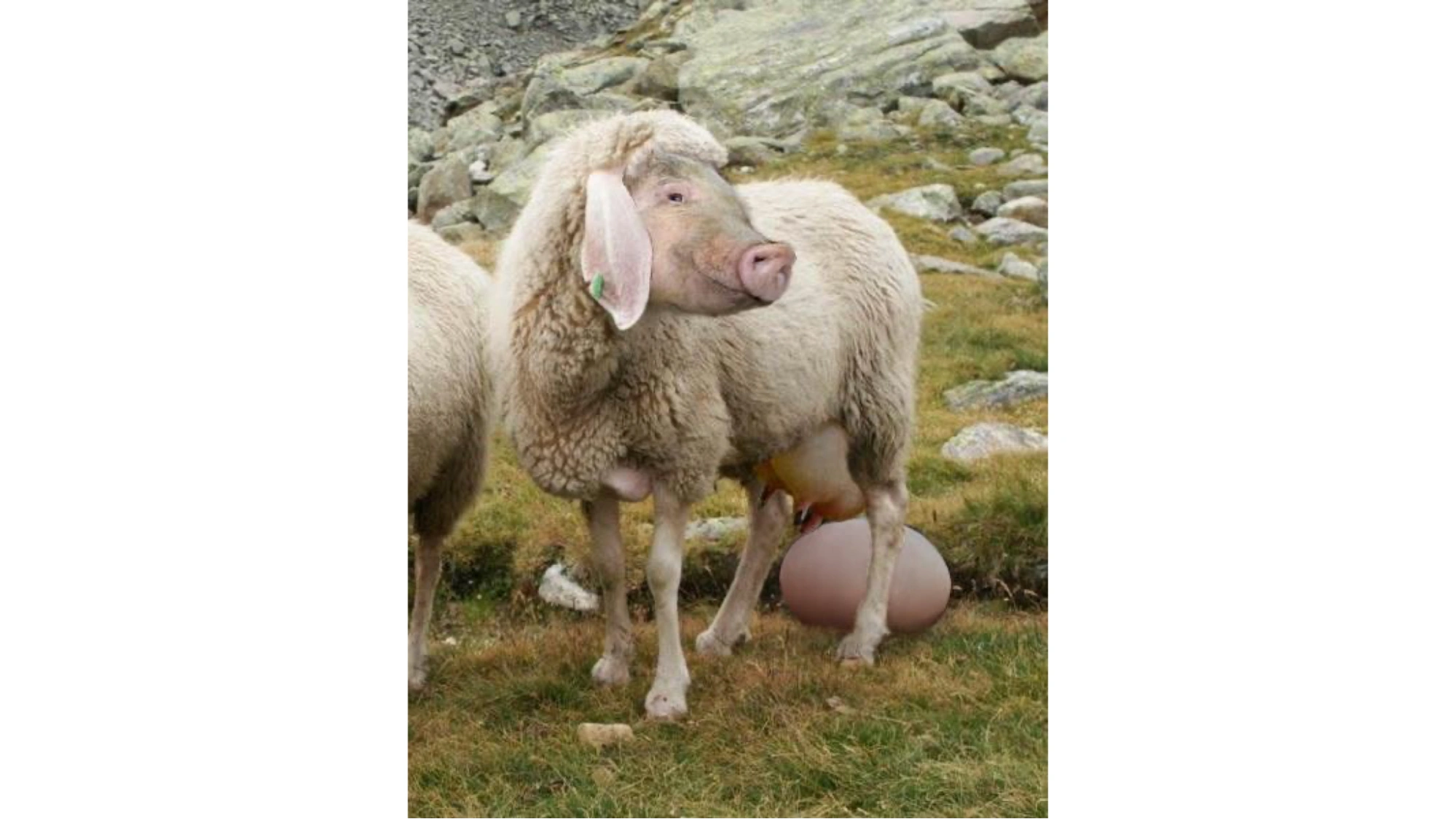
The “Eierlegende Wollmilchsau” | By Georg Mittenecker | CC BY-SA 2.5
In German, there’s a popular idiom of the “Eierlegende Wollmilchsau”. It roughly translates to an egg-laying wool-milk-pig. The phrase describes an imaginary animal that combines unique characteristics of some of the most renowned animal species: chicken (lay eggs), sheep (provide wool), cow (give milk), and pig (meat).
This idiom encapsulates what we are trying to achieve; a seemingly unachievable and perfect outcome of a product for diverse user needs: all the benefits, no drawbacks.
This article shares the steps we took to develop a design approach that reflects the ideal the egg-laying wool-milk-pig represents. When you finish reading, we hope you come away with the following lessons:
-
The importance of designing with people instead of for them
-
Understanding when to focus and when to see the big picture
-
User Segmentation: Meeting audiences where they are
-
Leveraging Data: Data doesn’t show where to go; it shows where you are
-
Focus Mode: Adding capabilities without distraction
-
-
Customization as a means to include: Optimizing the article experience based on different user goals
“We shape our tools, thereafter our tools shape us”
This quote by Marshall McLuhan feels very true for Wikipedia. Here’s why: When we improved searching for articles, we realized that people use Wikipedia in unique ways. Use cases and opinions for those who regularly use the Wikipedia app vary substantially. This difference of perspectives even rang true when learning from our target audiences what their communication preferences were:
Editors see a need for more editing capabilities:
“The only missing feature is providing notifications like on the website”
Readers love to read articles:
“Why would I need Wikipedia notifications? I don’t even have a login!”
Wikipedians long for missing key features:
“Please make it possible to access talk pages and edit histories.”
And others simply prefer the Wikipedia web experience:
“Functionally very similar to the web browser experience, if not less intuitive.”
This is just a tiny sample of the sometimes contradictory feedback we receive from people using our app primarily or in conjunction with other platforms. However, these examples exemplify that qualitative feedback points us in multiple directions, especially when we weigh the maturity of a wiki. So, when user feedback pulls us in multiple directions, how do we decide where to go?
It could be easy to rely on the intuition of the team. However, as we learned from the Inclusive Product Development framework, even with a globally dispersed, fully remote team that aims to live up to the organizational goal of embracing diversity, we must be wary of introducing our biases into the product and strive to be inclusive of these different audience goals.
Data doesn’t show where to go, it shows where you are
As we delve deeper into our quantitative data, there’s evidence of commonalities amongst different cultures, use cases, and needs. Our data scientist, Shay Nowick, was able to provide the insight that 62% of those that opt-in to share anonymized data visit the article view most frequently in the app.
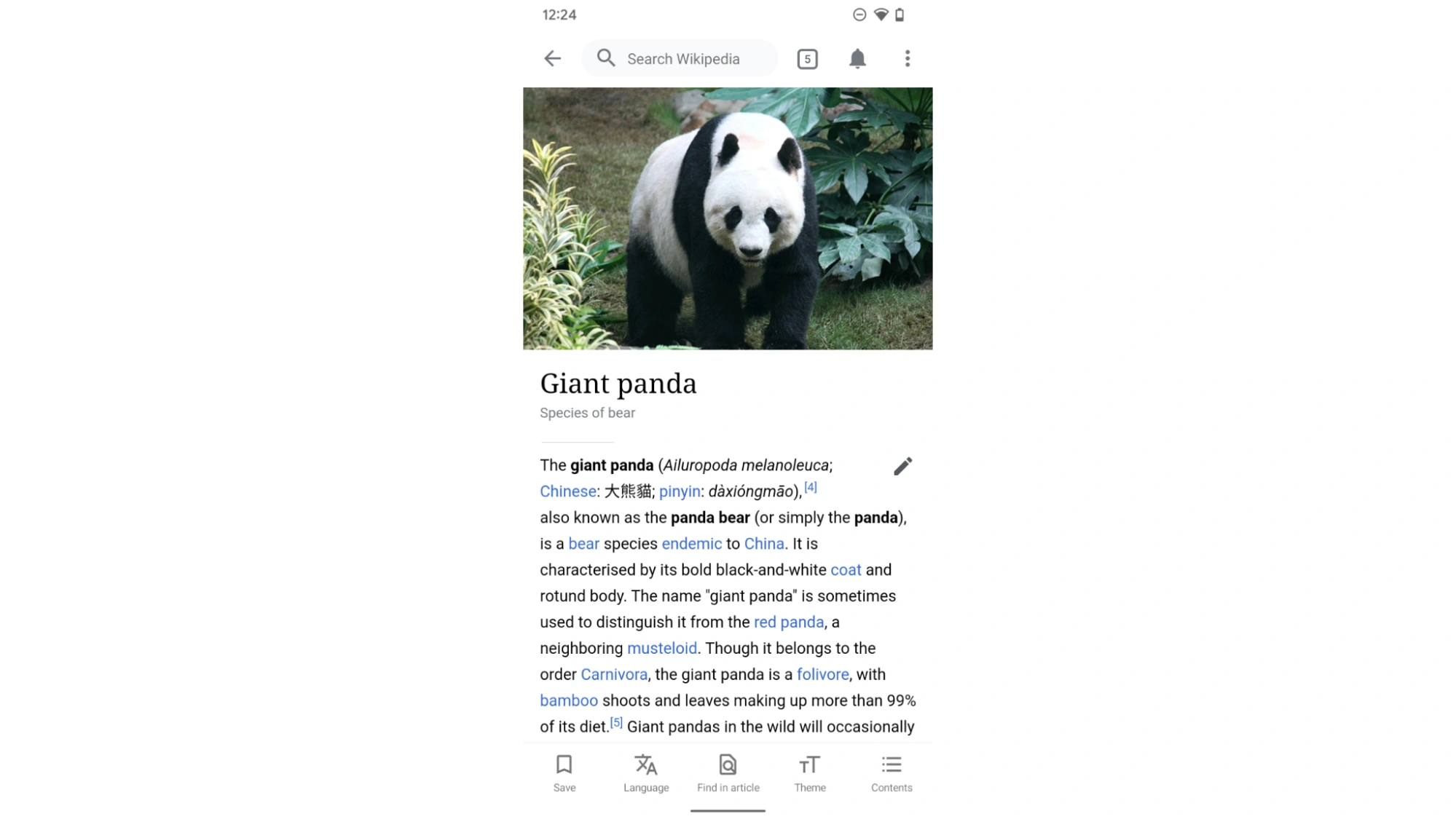
The article view is the most visited screen in the app.
This insight seemed logical considering the Wikipedia Android app was initially created as a “readers-first” tool. It always had editing capabilities, but the editing experience was historically limited, had a high participation barrier and resulted in a low edit count compared to other platforms.
Focus areas to create the egg-laying wool-milk-pig
Balancing reading and editing
In 2019, the “readers first” strategy shifted from full-article editing to explore the concept of micro contributions with the introduction of a feature called suggested edits. Micro contributions aim to lower the barrier to contributing by introducing an alternative to longform writing.
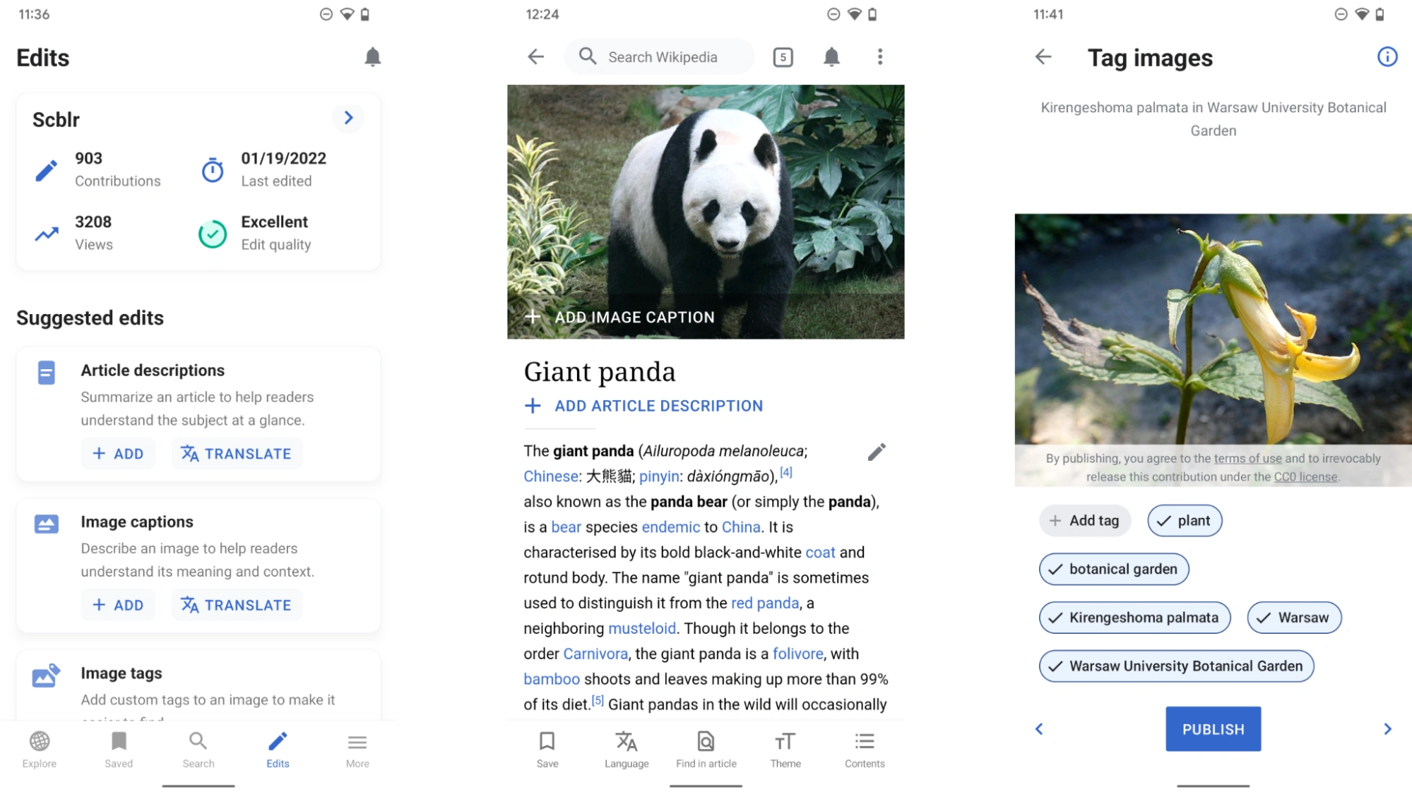
Suggested edits present opportunities for small but vital contributions to Wikipedia. We are aiming to raise edit awareness and make contributing more accessible.
In addition, we identified it as gentle onboarding for new editors, and creating new forms of content. As this capability was rolled out, the visibility and editing calls to action (CTA) were intentionally made prominent on the home page toolbar and in the frequently visited article view, shifting the UI away from the “readers first” experience.
However, this change could ultimately distract someone who just had the goal of reading as you can see in the example below:
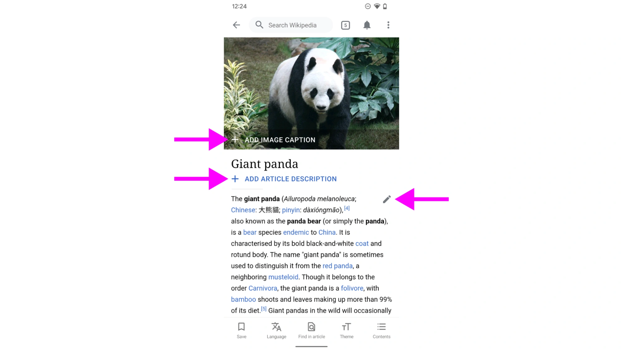
Multiple edit calls to action distract from reading the article.
Data shows that the edit asks were somewhat effective in encouraging readers to add missing article information. The + ADD ARTICLE DESCRIPTION button alone is the source of almost a fourth of all edits (~23%) made in the Wikipedia Android app. Adding the CTAs was a deliberate strategic move to encourage editing, and it seemed to be effective. Despite the distracting nature, hiding them for all people at all times was not an option.
But to the point someone raised about not always wanting to see editing features when they’re in the mood to read, how could we accommodate them?
In addition to not wanting to distract with too many editing call to actions, a community member left the following feedback on the Google Play store which made us question the article’s bottom toolbar:
“Why have you taken away the ability to go full screen? Why do we have to see the bottom toolbar all the time?”
“I want the option to hide the bottom bar as I scroll down. Thank you.”
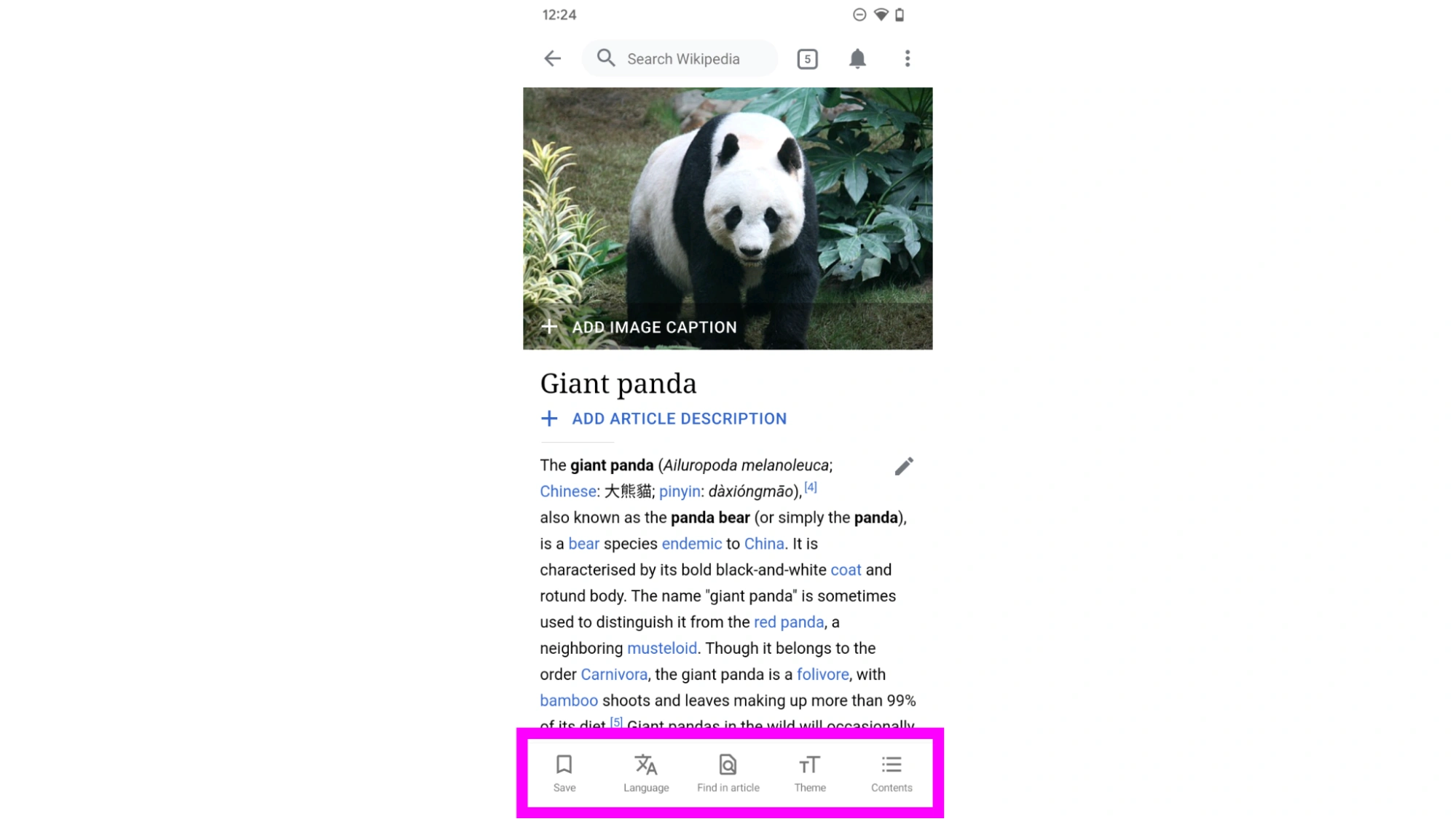
The article’s bottom toolbar stays visible when reading and scrolling.
Usability tests from three years ago gave us the insight that some users preferred seeing the bottom toolbar at all times or struggled to find features when the toolbar disappeared.. For example one user shared:
“I’m deleting the app because it doesn’t support find in page”
The article most certainly did support Find in page, we call it “Find in article” and it was located in the bottom toolbar that formerly disappeared on scroll.
Reading distraction-free
The insights mentioned above, paired with our desire to introduce more prominent editing features, like a prominent icon for talk pages to make it more discoverable, made our interest in honoring some explicit requests from the community to add a reading focus mode that much more urgent.
We chose to put the reading focus mode toggle into “Theme” because it’s related to existing preferences like font size or family. When reading focus mode is enabled, CTAs disappear, and the article becomes full screen on scroll, meaning the top and bottom toolbars disappear; limiting distractions while reading.
There was a concern within the team that users would have trouble remembering how to access editing features again once reading focus mode was enabled. To ensure we could overcome this obstacle we conducted usability testing with our partner communities.
Instead of using a clickable design prototype, our developers created a working prototype that our participants could download:
“It’s better, the full-screen mode makes it easier to read, there’s nothing that bothers me!” – Usability test participant, Arabic Wikipedia reader
“This reading focus mode is really helpful, excludes all unwanted options, it makes the page more comfortable to read” – Usability test participant, Hindi Wikipedia reader
“It’s a good feature as the majority of us are here to read articles. It’s a good function to have to limit distractions.” – Usability test participant, Japanese Wikipedia reader
These insights gave us the confidence to release the feature to production and enhance discoverability. Check out the detailed analysis to dig deeper into our findings.
Reading focus mode was also a success from a quantitative perspective. After its release, 80% of all people discovering and interacting with the feature kept it as their default preference. We did consider making this feature a default experience, but wanted to ensure users knew they could edit, and for that reason we will continue to have reading focus mode disabled by default.
Customizing the experience
Reading focus mode was not the only feature where we aimed to strike the right balance between the needs of readers and editors. As we added more features to the app, our overflow menu grew, and we noticed users asking for features that existed but were hidden in the overflow menu:
“Doesn’t allow you to read the page’s Edit history or Talk page. So practically only useful for reading, not editing.”
“It has good features like a menu option to switch between languages”
“No option to add to Watchlist, I don’t like the interface or look.”
“It’s missing categories.”
“Please add the capability to share an article’s URL.”
Depending on the maturity of the wiki, the audience, and user goals, the preferences for what links were available varied, which made it apparent that the next phase of our work before releasing new communication features needed to take a closer look at shortcut usage in the bottom toolbar and the top menu:
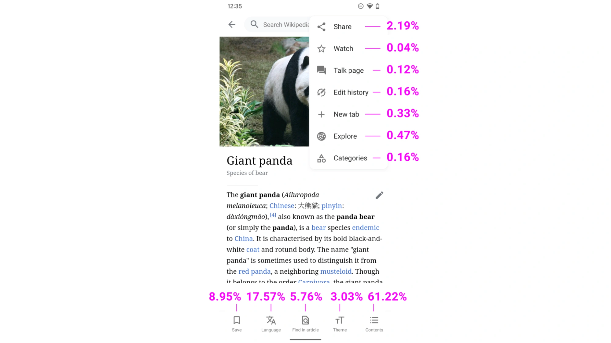
Our data informed us that the bottom toolbar and top menu usage ranking were as follows: 1. Contents (61.22%) 2. Language (17.57%) 3. Save (8.95%) 4. Find in article (5.76%) 5. Theme (3.03%) 6. Share (2.19%) 7. Explore (0.47%) 8. New tab (0.33%) 9. Categories (0.16%) 10. Edit history (0.16%) 11. Talk page (0.12%) 12. Watch (0.04%). Note that newer features, and features hidden in the overflow menu were clicked less often.
Designing for people’s preferences while keeping the experience focused challenged us, but is becoming more of an industry standard with the launch of Material You. Relatedly, one of our approaches to toolbar customization was inspired by Google Chrome. We explored the idea of adding all items to the top menu.
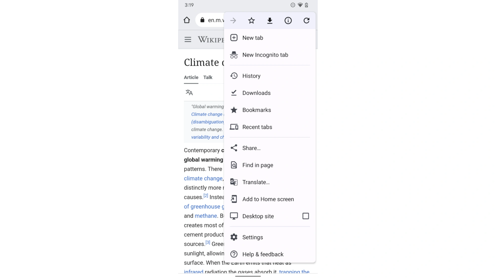
Access to the actions and destinations in Chrome on Android.
We asked ourselves if putting all options into one place is considered good or bad information architecture and found the answer in existing research. Hiding interface elements reduces their usage as they are less discoverable. We did not want actions related to the article to be less used, as our audience finds them helpful, so we continued with having shortcuts in the bottom toolbar.
How the-egg-laying wool-milk-pig came to life
Prototyping the first version
We landed on letting people customize their shortcuts in the bottom toolbar, and developed several prototypes to test which approach best achieved our goal.
We learned that people had difficulties discovering the “Customize toolbar” feature within the “Theme” shortcut, trouble discovering where items that were moved out of the toolbar and into the overflow menu were placed and issues dragging and dropping items, a gesture we incorrectly assumed would be intuitive. This implored us to have a closer look and ensure our drag and drop movements met Web Accessibility Guidelines(WCAG).
To address the discoverability issues we added onboarding tooltips, even with this addition, users were struggling to find the feature and effectively scrolled past it making it disappear. You can read our analysis for full details.
Testing, discarding, and iterating
We now faced a real example from the inclusive product development playbook of having to choose equity over speed. After sharing the results with our communities and collaborating with other Wikimedia Foundation teams like the design team, we created two iterations of the original design:
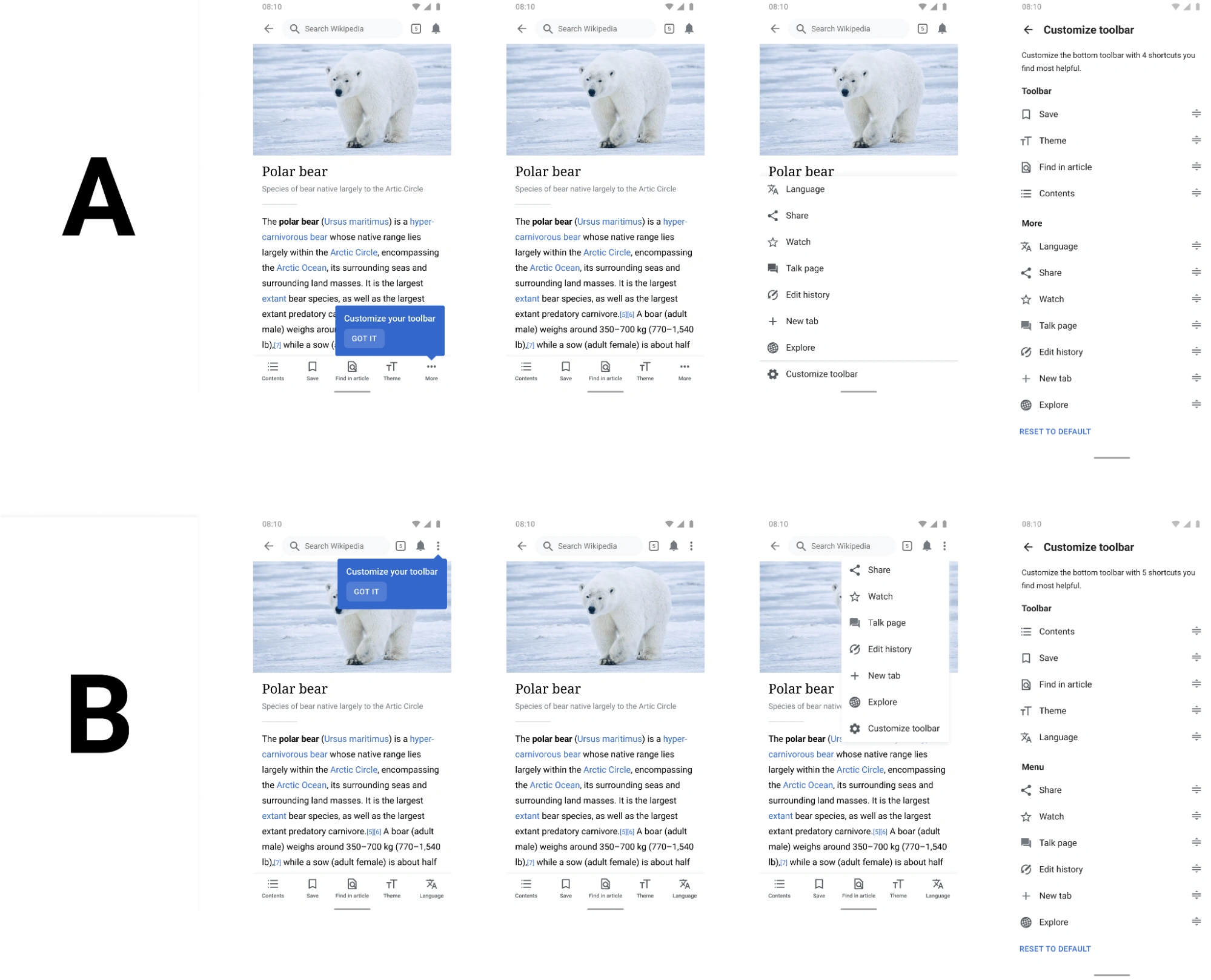
Variant A featured a ‘More’ menu item in the bottom toolbar alongside four shortcuts that could be customized. Variant B used the top menu as the entry point to customization, leaving the bottom toolbar largely unchanged.
The goal was to determine which of the two versions participants preferred, why they preferred it, if there were differences amongst language preferences and if the participant would use the feature. Both variants featured:
-
A persistent tooltip that only disappears when pressing the newly added ‘GOT IT’ button.
-
In partnership with UX copywriter Jacqui Clydesdale, we created default helper tooltips to explain the drag and drop function.
-
Simplified language (e.g., ‘shortcuts’ instead of ‘links’), to ensure terminology was accessible .
After doing one more round of usability tests, we gathered feedback on the two variants from ten Arabic, Hindi, Japanese, Indonesian, and French-speaking participants. The results were almost evenly split, so we could not take a majority wins approach. It was evident that both variants were drastic improvements when it came to discoverability and usability. With no clear winner between the two variants we took into consideration Google material design guidance, and considered which change would be less jarring for our existing audiences. This led us to move forward with variant B. The reactions to the updates in variant B were:
“It’s awesome, it was easy to understand and find.”
“The design is very good, I haven’t seen this anywhere else.”
“I’d use the feature 2-3 times and think it’d improve the experience.”
“It’s a very good feature for people who use Wikipedia daily.”
“There’s one more shortcut in the bottom toolbar, a lot of people have a habit of clicking the top menu to look for things.”
Although we chose our path forward between the two variants, there were still issues that were exposed in usability testing that we found important to address before a full roll out could occur.
Designing cross-cultural
As we mentioned above, we aimed to partner with very specific audiences. When conducting usability testing it was important to test with our partner community in their native languages. Building real installable app versions in Android’s file format apk made the difference. Due to testing working app versions, we identified various localization issues, and prioritized solving them before release.
Within the Wikimedia Foundation it is customary to use an open-source translation service in partnership with our community called translatewiki.net. The project, made available by Niklas Laxström, is sensitive to the unique vocabulary used on Wikipedia and is able to consider nuances that machine translation doesn’t always capture. However, because it is community sourced, we do have to take our time in waiting for the translations to come through, or even reaching out for support before launching usability testing.
Notably, a third of our readers access Wikipedia in multiple languages. As usability test participants were bilingual too, we noticed that people’s device and app language differed. This is not necessarily bad, as it leads to observing even more diverse forms of use. However, for our purposes we deliberately wanted to test in Arabic, Hindi, Indonesian, Japanese, and French, so we asked people to set their device language at the beginning of the test.
This step was very important because it exposed bugs and unexpected behaviors for right-to-left (RTL) environments earlier than waiting for users to alert us via the app store. Namely, when conducting usability testing, we observed glaring bugs with the direction of typography, icons, and images in RTL that needed to be corrected prior to release.
With the support of our Product and Technology leadership to build for equity over speed, conducting design research in regions and languages beyond the English-speaking community will continue to be our team’s default. As will it continue to be our team’s default to prioritize fixing potential localization challenges and improving accessibility across cultures, languages, abilities, interests and backgrounds.
While an egg-laying wool-milk pig does not exist in nature, we have the unique opportunity to design the closest ideal in a digital product. And, by fulfilling one user group’s needs, tremendous advantages will inevitably present itself in serving the needs of others.
We are committed to equitably design with everyone and modify the proverbial table to include as many as possible — and we think you should too.
All the features mentioned in this article are now available in the official Wikipedia for Android app on Google Play. Our team is working on many more exciting features to offer all the advantages and satisfy (most of) our user’s sophisticated and sometimes even contradictory needs in the near future.
Follow @WikipediaMobile on Twitter for the latest news related to Wikipedia apps. If you don’t want to miss the latest design changes to Wikipedia, follow @WikimediaDesign. Please let us know what you think about the updates in the comments below, on MediaWiki or email.
Thanks to Matt Cleinman, Shay Nowick, Matthew Williams, Carolyn Li-Madeo, Johan Jönsson, Lucy Blackwell, Sam Patton, Rita Ho, and Jess Klein for their contributions to this article.