Universe image adapted from Alexander Meleg, CC BY-SA 3.0, via Wikimedia Commons
Introduction
Trying to find a job during the peak of the pandemic as a junior UX designer was a grueling process, but after months of applying, I was given the opportunity to start a 9-month internship at the Wikimedia Foundation. There are a limited number of junior design positions out there that allow new designers to gain the experience required to propel their careers forward. This blog post is intended to share insights from my experience, specifically in these areas:
- The application process
- Design at the Wikimedia Foundation
- Summary of the Growth project
- Summary of the Editing project
- Summary of the iOS work
- What’s next?
The application process
I was applying to purpose-driven organizations because my personal values most closely align with workplaces that aim to have a positive social impact. I was interested in working at the Wikimedia Foundation because I have been a supporter of their mission and have learned about their impact through commons, peer-to-peer, and Transition Design literature. Hence, I decided to apply for a UX Design role there, and to my surprise, I was invited to interview for the position a couple of weeks later.
The interview process
The interview flew by and the hiring manager shared that there were many strong candidates that applied for this role. Generally, the Foundation has only one designer per product team so they hire designers with more experience. She mentioned that there might be an internship program later on but currently there was none. I did not get the UX Designer role that I applied for, but weeks later they reached out and offered me an internship role. Due to the pandemic, they needed someone to help out on the Design team. Since this position didn’t exist in the past, the management didn’t have a clear vision of how I would spend my time, but they offered me to work on a couple of teams and participate in the Foundation’s organizational meetings and events. I accepted the role right away.
Internship overview
During the nine months, I rotated through three different teams, which included Growth, Editing, and iOS, where I took over small projects parallel to the team’s main work. Spending time with more than one team allowed me to observe different team processes and work on a variety of deliverables. I was also able to attend all of the design team meetings, product pre-release demos and take part in Wikimedia-wide events.
The Foundation is a fully remote, nonprofit organization that has a very welcoming, engaging, and collaborative environment. The design team is distributed across a number of projects and time zones, but the whole team meets on a weekly basis, which allows the designers to share their work, discuss relevant topics and get valuable feedback from one another.
Work on the Growth team
The first 4 months of the internship I spent on the Growth team working on a mentorship dashboard. The team generally focuses on developing software that can help engage new contributors, especially those in mid-size Wikipedia projects. Engagement over the years has decreased because new contributors need to learn technical and cultural skills to start contributing to Wikipedia, and it is not always straightforward to acquire these skills. The team has previously built a newcomer homepage, which is a primary feature in the team’s core objective to improve newcomer retention. The newcomer homepage has a range of modules, one of which is the mentor module where the newcomer can reach out to an experienced editor with questions or concerns. Currently, the mentors don’t know anything about their mentees until the mentee reaches out to them. I was assigned to improve the mentor experience, which included understanding the mentor’s needs and frustrations and designing a dashboard that would allow them to be more proactive in their mentorship role.
Support
- Throughout the project I had support and guidance from the designer on the Growth team, who met with me on a weekly basis and gave me feedback on my process and designs. These meetings kept me on track and helped me plan out my weeks.
- Additionally, I met with the project manager on a biweekly basis where we discussed timelines and other milestones like presenting research to the team.
- Later in the process, I had weekly meetings with the engineer who worked on the project with me and was a great support throughout my time on the team.
Discovery phase
I began with exploring the problem space by studying mentorship, existing Wikipedia projects, and external mentoring platforms. The research helped me get accustomed to the Wikipedia-scape, but I still knew little about mentorship on the platform. Therefore, I decided to conduct interviews with mentors on wikis to which the Growth features have been deployed and talk with mentors on Russian, Ukrainian, Arabic, Vietnamese, Czech, Hungarian and French wikis.
The research goals for the interviews were to:
- Understand the general profile of a mentor
- Understand the mentor’s motivations and attitudes regarding mentoring
- Understand processes & behaviors
The interviews
After transcribing and consolidating the interviews I learned that there was a continual thread that linked the mentors: their willingness and patience to teach and help newcomers. Almost every mentor I interviewed had a good experience with a mentor figure when they first started editing Wikipedia and many of the mentors were motivated by this. Most importantly I got to understand what these mentors would like to have in their dashboard:
- An overview of their mentee list and mentee contributions.
- Template answers for the most frequently asked newcomer questions
- Better mentor-mentee related notifications
- Better support and training for mentors
- For mentees and mentors to be matched by interest or demographic
Defining and Visual Design Phase
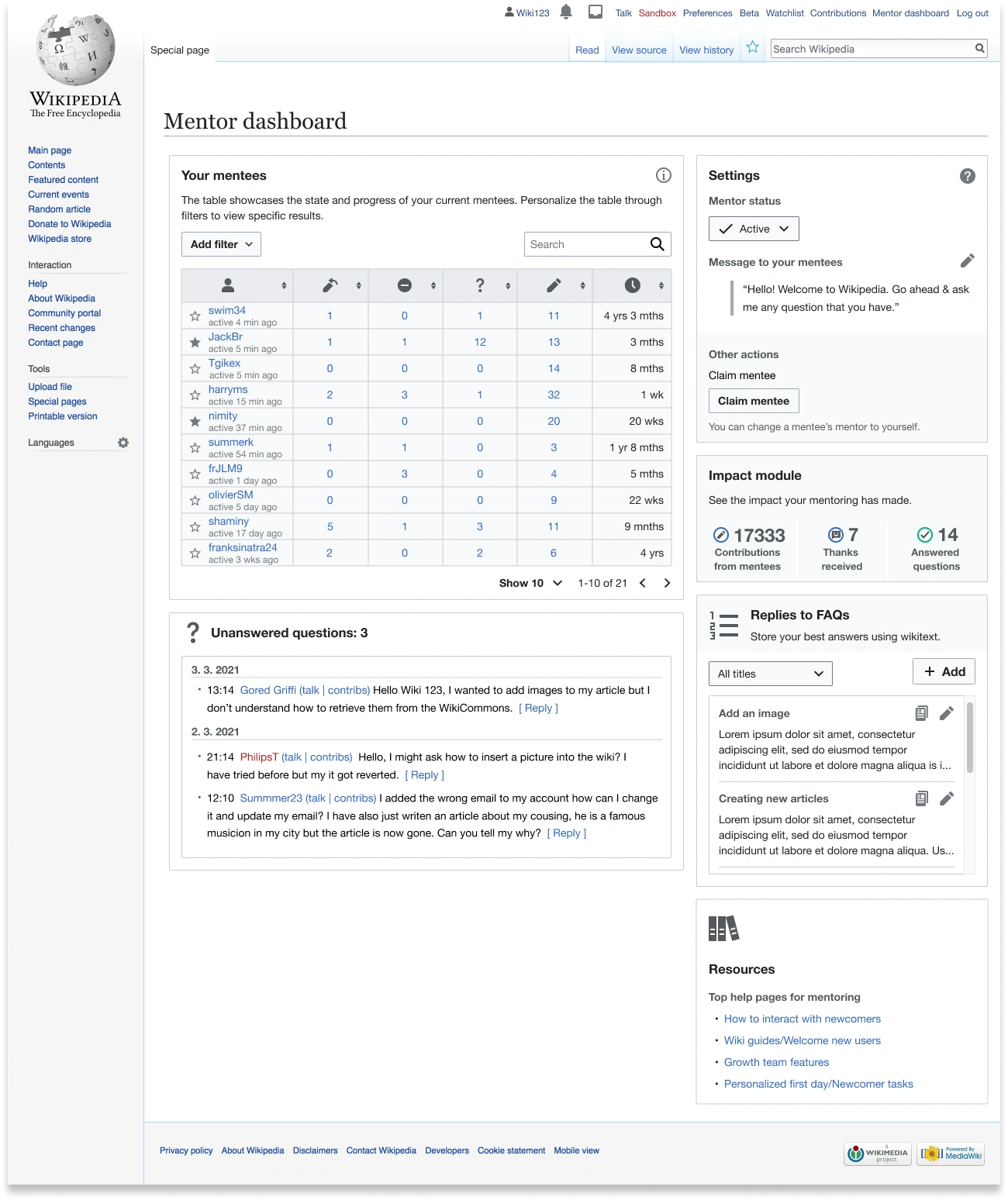
Based on that information I proceeded to design modules that would showcase information that would help mentors communicate with their mentees, motivate them and help them be better in their roles. It was important to consider the existing workflows of experienced editors and ensure that the dashboard was not a hindrance to them. I designed the following six modules for the first version of the dashboard:
- Mentees overview - a module where mentors can view information about the newcomers that were assigned to them.
- Settings - dashboard settings where the mentor has an overview of their current status and the welcome message the newcomers see
- Unanswered questions - a space where mentors have access to questions they haven’t yet answered from their mentees.
- Replies to FAQs - the mentors own saved answers that they can reuse when answering mentees’ questions.
- Your impact - this would show the number of contributions their mentees have made, thanks they have received and total questions the mentor has answered.
- Resources - is a module that holds the most useful links to resources a new mentor might need.

All 9 of the proposed modules for the mentor dashboard.
Reviewing the designs
The designs were reviewed by the Growth team and discussed at the design team’s weekly design review. The feedback that followed was incorporated into the mockups. Receiving feedback from the other designers was an excellent way to improve my work and it was one of the main ways that I was able to continuously learn. Additionally, the presentations by other designers were a great source of learning and inspiration.
Development Phase
I worked closely with an engineer to build out the top 3 modules for the first version of the dashboard, which was then tested with the community. The modules included the mentee overview, settings and resources. Once the modules were almost ready I ran a moderated remote usability test with the goal of identifying opportunities for usability improvements related to placement, priority, navigation, and orientation. I also wanted to test whether the V1 of the dashboard had met the mentor’s expectations and see what a V2 version should prioritize. The key findings included:
- Everyone quickly located the dashboard and the participants found the ‘mentee overview’ to be important. However, they didn’t find the module as functional as others. They wanted further ability to interact with the table.
- According to the mentors, the second version of the dashboard should include further modules such as, ‘unanswered questions’, ‘replies to FAQs’ and the ‘impact module’.
Lessons learned
Biggest learnings and takeaways from the Growth team project:
- Experience working on a constantly evolving, iterative project.
- Took part in team discussions about their ongoing projects and processes.
- Learned about ways the product teams deploy projects and disseminate information amongst other teams.
- Learned how to work with the community.
Daily skills and processes:
- Got in the habit of documenting all of my work to ensure that the information can be easily shared among other teams and the Wikimedia community.
- Ran moderated usability testing.
- Learned about design systems and got more comfortable using the component library.
Work on the Editing team
For the second part of the internship, I spent time with the Editing team which works on editing tools across projects and improves the editor’s ability to contribute to Wikimedia projects. My project revolved around researching and exploring a tool that would help new contributors become more successful at publishing edits that adhere to Wikipedia’s policies and guidelines. Currently, many new contributors’ first edits get reverted at Wikipedia because newcomers are not aware of existing policies and guidelines. Having their edits reverted demotivates the newcomers from making further edits and lowers newcomer retention. Hence, the tool could:
- Make contributors aware when their edits defy existing policies or guidelines before they publish their edits
- Help to educate newcomers about policies and guidelines
- Diminish the frequency of the newcomer’s first edits being reverted
Support
- Similarly to the Growth team, I met with the Editing teams designer on a weekly basis
- In this team I had a set of deliverables that were determined by the project manager and designer with whom I met multiple times to discuss and present these deliverables
Discovery phase
The first phase of the project included putting together a research report that would identify the known and unknown areas of the problem space. The research included information such as:
- The newcomer editing experience
- Ways experienced contributors interact with newcomers
- The history of policies and guidelines at Wikipedia
During the initial research, I learned about the evolution of the policy space at Wikipedia. Writing articles for Wikipedia was an iterative, inclusive and collaborative process where editors could co-create content. As the size of Wikipedia grew, one of its strongest criticisms was that it was an unreliable resource. Over time, community members have made quality control one of the wikis primary focuses. In light of making the information more reliable, the number of policies and guidelines has increased over the years. There are now more policies and guidelines than ever before, they have become complex and are cited much more frequently by editors as a means to support their activity on Wikipedia.
The team spoke about choosing one policy and using it as a way to help guide the project, it would serve as the policy to showcase the potential editing tool. After consideration, I decided to focus on verifiability, as it is one of the most important policies for newcomers to be aware of. Since Wikipedia is an online encyclopedia, its content must stem from reliable sources, and therefore defying the verifiability policy while editing will ensure that the editors’ contributions will be reverted or deleted. During the next phase of the project, I did a comparative analysis of Wikipedia projects as well as external platforms and apps whose objectives were to help teach contributors a specific skill set. I looked mainly at:
- Grammar correction apps/writing apps
- Education apps and extensions
- Existing Wikipedia projects
- Gamification methods
This aided in narrowing the ways the editing tool could be displayed.
Defining phase and the visual design phase
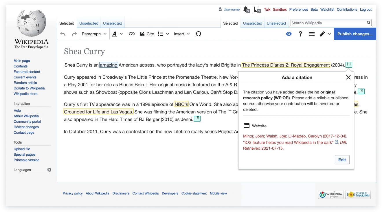
This was a difficult phase of the project. With so much valuable information and perhaps more questions than when I had started, I took the first stab at designing the editing tool. The editing tool is a feature that contributors would be able to use to see areas in the text that defied the verifiability policy. For instance, the tool would suggest placing citations in certain areas and it would highlight titles that need to be linked. Additionally, the tool would allow users to quickly access resources about verifiability.

A version of the Policy Check with all recommendations and content located in a side panel.

Another version of the Policy Check where recommendations appear inline with the text
Presenting at Wikimania
Through the editing team, I was able to present the editing tool project at Wikimania 2021. I presented with other volunteers in a talk called ‘Editing the Wiki Way: software and future of editing’. I was able to meet numerous committed community members that are passionate about various projects and discuss the future of editing with them.
Lessons learned
Biggest learnings and takeaways from the Editing teams project:
- Gained experience working on a research-heavy project
- Took part in team discussions about their ongoing projects and understood the processes and how these are similar/different to the Growths team.
- Learned a lot about policies and guidelines on Wikipedia.
Daily skills and processes
- Put together a research report
- Gained practice presenting my process and artifacts to a multitude of people.
- Became more comfortable using Miro diagrams.
Work on the iOS team
The final and shortest stretch of the internship was with the iOS team. They are part of the Wikimedia Apps project together with the Android team. The apps teams are historically considered to be more experimental, in part because they have lower user traffic than the desktop and mobile versions of Wikipedia and are used more by readers rather than power editors, who generally engage differently with existing features. It was very interesting to learn a completely new set of processes and to get accustomed to using the apps style guide and a slightly different product altogether.
Support
- In the iOS team I also met with the designer on a weekly basis and had meetings with the project manager every 2-3 weeks.
Tasks
The team was working on a notification center during my time there and I was tasked to complete a set of audits, do research, and do smaller design tasks that would be helpful in the future. I really appreciated that the team prioritizes designing and developing for a variety of accessibility needs. This is made possible by Swift, Apple’s native programming language, which allows one to easily create products that give support to those who might be, for example, visually impaired. Through the variety of deliverables, I was able to engage with different parts of the app and learn more about another pocket of the wiki-verse.

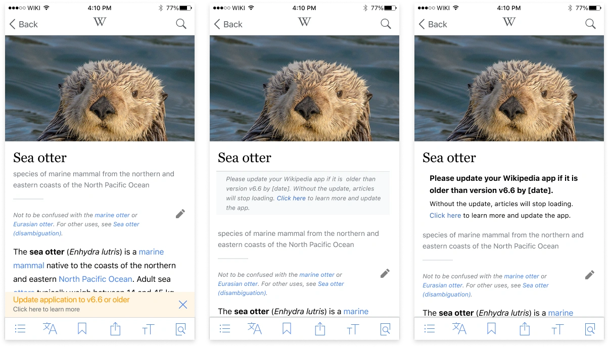
One of the first tasks I worked on - the iOS mobile banner warning explorations. We ultimately chose the middle option where the warning has a background color and is inline with the text.
Lessons learned
Biggest learnings and takeaways from the time spent on the iOS team
- Designing for iPad
- Learned more about Apple’s accessibility support
- Learned about iOS UI and deployment processes
Daily skills and processes:
- Learned about the iOS team’s design & engineering processes
- Became comfortable doing design audits
- Got to know Apple’s Human Interface Guidelines in greater detail
What’s next?
I could not have wished for a better internship experience! The 9 months were incredibly diverse, challenging, and fun. I was supported throughout by amazing designers, project managers, engineers, and numerous different team members from the Growth, Editing, and iOS teams, who worked with me to improve my skill set as a designer and helped me find my footing in the wiki-verse.
Since my internship, I have been offered the opportunity to join the iOS team full-time. The design team is interested in creating more formal internship opportunities for junior designers. This year they have welcomed two new interns to the Design team, and hopefully there will be more internship positions available in the future.
Thank you to Lucy Blackwell, Rita Ho, Jess Klein and Carolyn Li-Madeo for this opportunity, as well as your support and feedback!
