By Kieran McCann & Bárbara Martínez
Introduction
By Kieran McCann
When I first started working at the Wikimedia Foundation I was surprised to discover that although our projects used some basic layouts, there was no underlying layout grid system. As a visual designer, who originally studied graphic design from a print perspective, this felt like an elementary part of our design toolkit was missing. Without a grid system, making decisions about where items should sit on the page, and maintaining visual consistency across multiple projects would be more challenging.
Maybe I shouldn’t have been surprised. Wikipedia launched in 2001 when the web, and certainly modern web design, was in its infancy. Since its launch there have been relatively few major design iterations. Indeed when I started in early 2021, the last release of a new ‘skin’ – the template which changes the look and feel of a Wikipedia – was Vector (now called Vector Legacy) which was deployed in 2010. Back then there were limited methods to apply layout grid systems on the web – both CSS Grid and Flexbox were still in the early stages of development and not well supported – so it is not surprising that a grid system was not implemented as part of this release. There were later attempts to introduce a grid system, which was implemented to our Content Translation project, but to retrofit a grid to already existing projects would have been a major undertaking, so that grid was not applied globally.
Luckily, when I joined the Foundation, one of my first projects was working on the visual design for the Desktop Improvements project. This would be our first major redesign of the web interface in twelve years and as such would be a rare opportunity to rethink how we approach layout across the wikis and, importantly, to develop a grid system.
What is a grid system and why do we need one?
A grid is a system for organising content within space – that could be a printed page, screen or the built environment. A grid creates visual rhythm that helps us navigate space and content. To appreciate the importance of grids think about how you read a newspaper or walk around a city. You might not be particularly conscious of the grid but without it your ability to consume the content or find your way around would be much more difficult.
In terms of modern user interface design a grid system is particularly important in allowing us to create flexible but consistent layouts across the huge variety of screen sizes that people may be using. By using a fluid grid we can divide the page width into several equally sized and spaced columns. Page content is then placed in alignment with these columns and when the viewport expands/shrinks horizontally, these fluid grid columns will expand proportionally.
A grid system is also a valuable tool for the design team because it will allow us make design decisions based on a documented structure that we are all using, which in turn will help us to design more efficiently and consistently.
Initial proposal
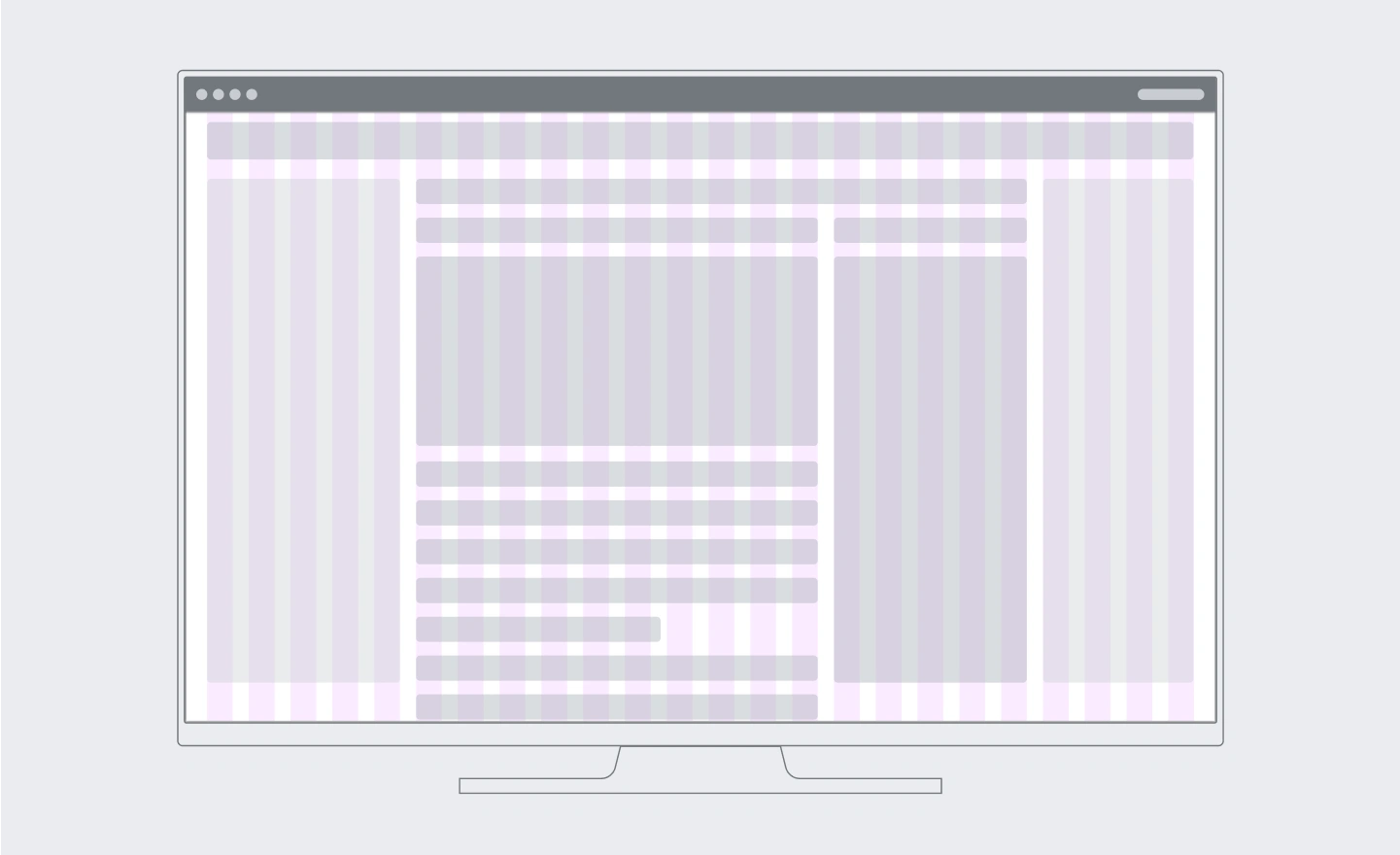
In my initial grid explorations as part of the Desktop Improvements project I quickly settled on using a 12-column grid for larger screen widths. The advantage of a 12-column grid is that it offers a wide range of column combinations to create both symmetrically balanced layouts and flexible, asymmetrical layouts. The latter is particularly useful for less standard compositions with different types of content, such as the dashboard format of the newcomer homepage.
A 12-column grid, however, is only functional up to a certain screen width. Once the screen gets too narrow then single columns stop being a useful measure. I proposed to use different grids for the different breakpoints and devices (desktop, tablet, mobile) since at smaller screen sizes you need less layout flexibility.
One of the added advantages of this proposed flexible grid is that it opened up the possibility of making the new skin we were working on more responsive to screen sizes.
This proposal was then tested with various layouts used across the Wikis and then passed over to Bárbara and the Design System team to turn it into a workable design tool.
Defining a systematic solution for the grid
By Bárbara Martínez
After drafting the initial proposal, the Design System team and I started working on the systematic solution for this grid in order to create a solution that scales to any current and future Wikimedia web project.
Elements to fit in the grid
A systematic grid solution must include the following elements:
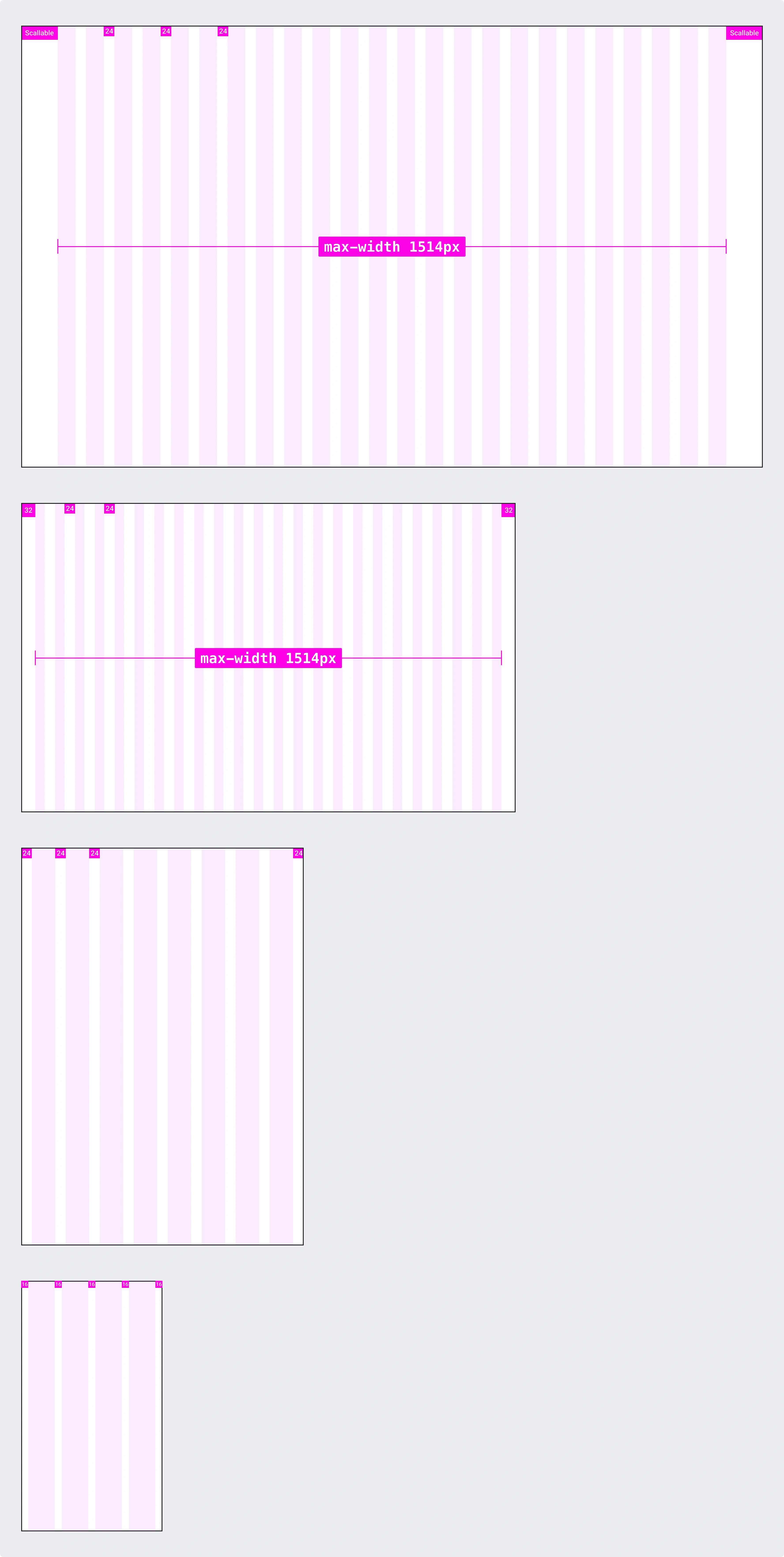
Grid elements
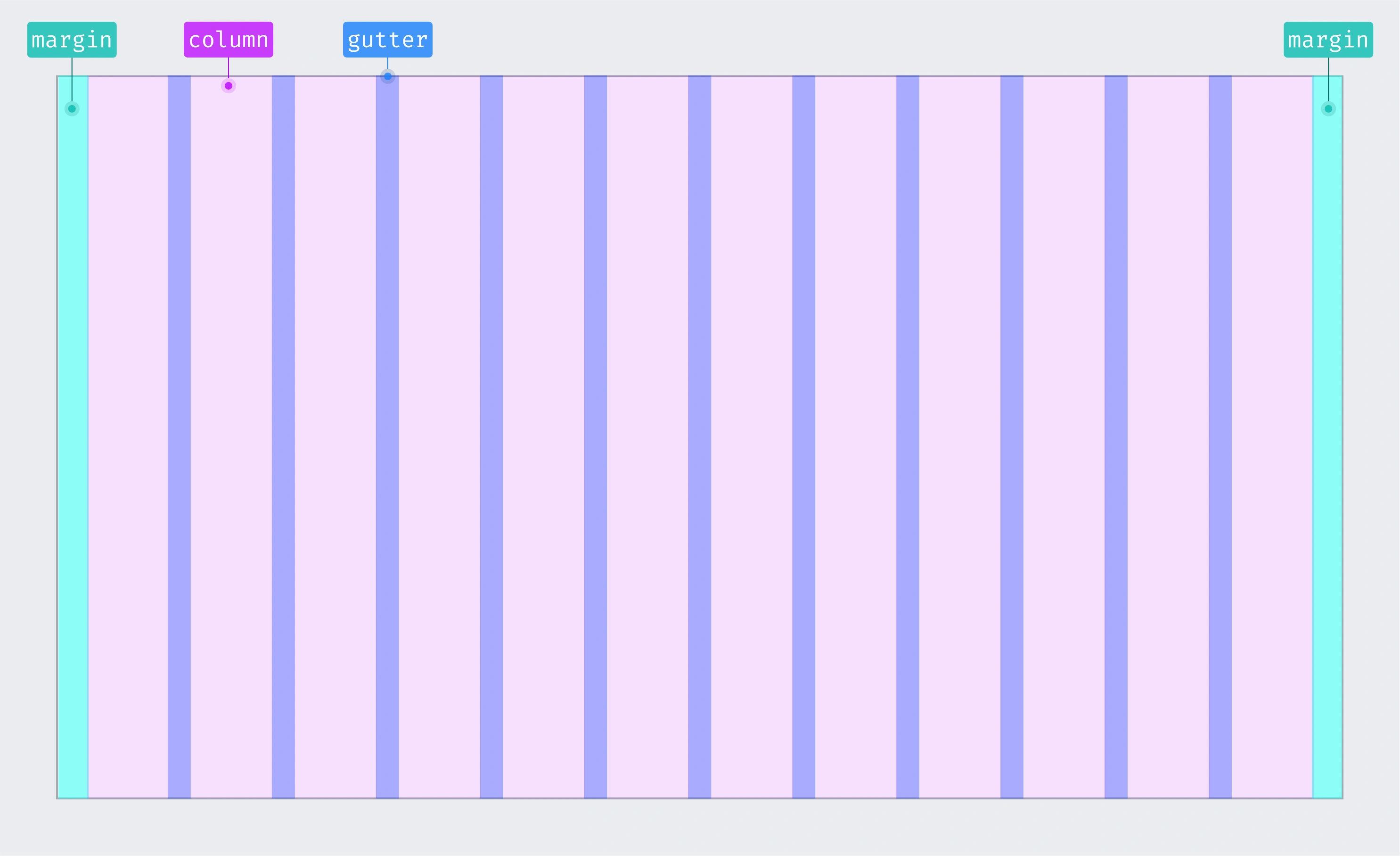
- Grid columns: vertical blocks are used to create and align the screen content. Breakpoints will determine the number of columns displayed in each screen size. The layout will be adapted to the available space on larger screens by using more grid columns. We will therefore use more grid columns on larger screens than on smaller ones.
- Margins: separation between grid columns and screen edges. In each breakpoint, margins might differ, and they could be fixed or scaled. We will use bigger margins on larger screens in order to create more space between the content and the screen edges.
- Gutters: horizontal separation between the grid columns that help separate the content blocks on the page. Gutter width might be different in each breakpoint range and they will be bigger on large screens since they help to create more space between columns.
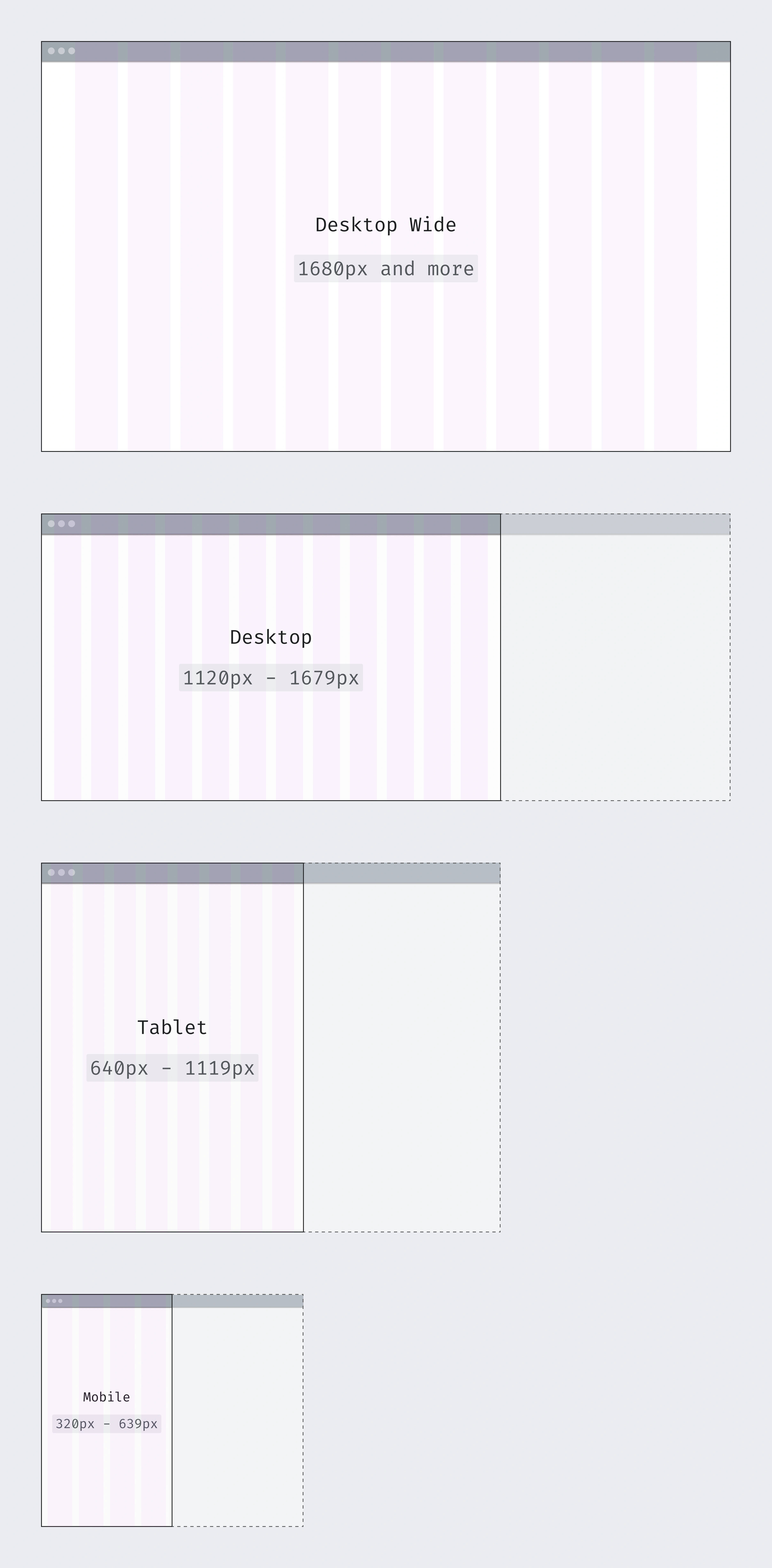
Breakpoints
Breakpoints are the screen size ranges where the design fits certain characteristics. They are created to adapt the layout as well as possible to each screen size.
Breakpoints are decisive in the creation of the grid system since the grid elements will adapt to each breakpoint range.
For this reason, the following breakpoints were previously created:
- Desktop Wide: 1680px and larger screens
- Desktop: 1120px - 1679px screens
- Tablet: 640px - 1119px screens
- Mobile: 320px - 639px screens
Layouts
Layouts define the content structure for each page. Layouts are created by placing blocks of content on the page, in order to create a template that can be reused on other pages. We will use each layout according to the design requirements.
After analyzing all the Wikimedia projects, we categorized the page content into 3 different layouts:
Left panel layout (ToC)
Layout without side panels
Full width layout
Problems found with the 12-column grid on desktop
Although the 12-column grid is one of the most common grids used for desktop, it didn’t allow us to cover the main use cases of our product. After testing the 12-column grid with the most important Wikimedia projects (Wikipedia, Abstract Wikipedia, Wikimedia Commons, Special Search, Growth…) and layouts, we ran into some problems creating a systematic solution with this desktop grid.
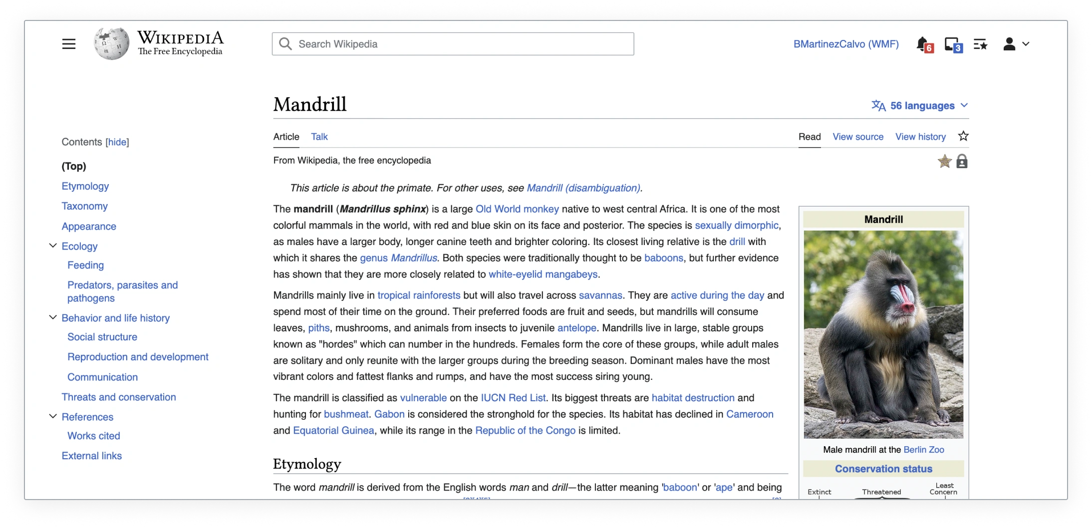
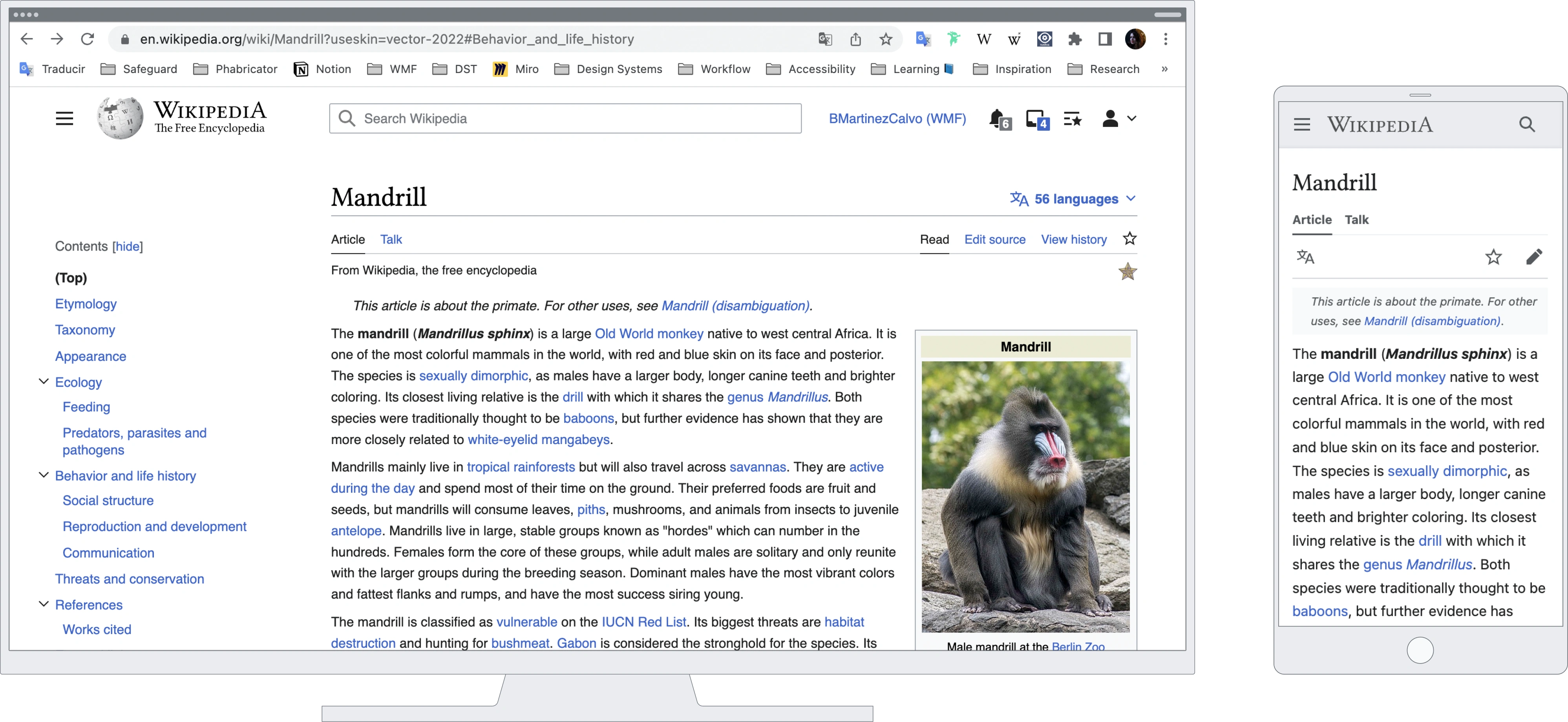
We found a major issue to fix while testing the 12-column grid with the Wikipedia article content and the table of content (ToC). Based on previous research and user testing, we needed to cover some minimum and maximum widths for certain page elements. In order to ensure proper legibility, a max-width of 960px was required for the article content. Also, the ideal min-width for the ToC was 200-245px.
Trying to find the ideal margins and gutters in this 12-column grid for desktop was difficult. We either achieved the article content max-width or the ToC min-width, but never both at the same time. In most cases, the ToC was too narrow.
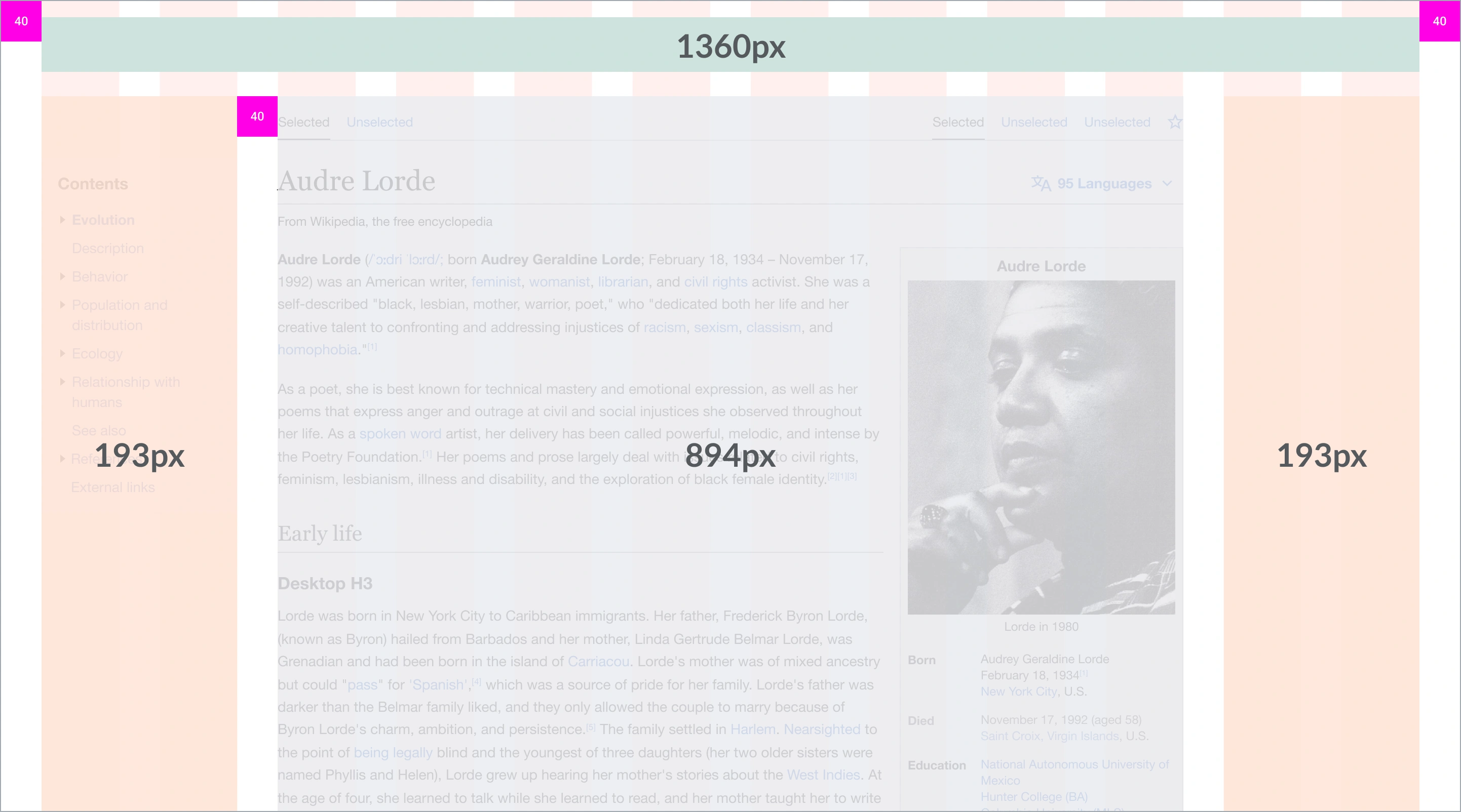
40px margin - 40 px gutter
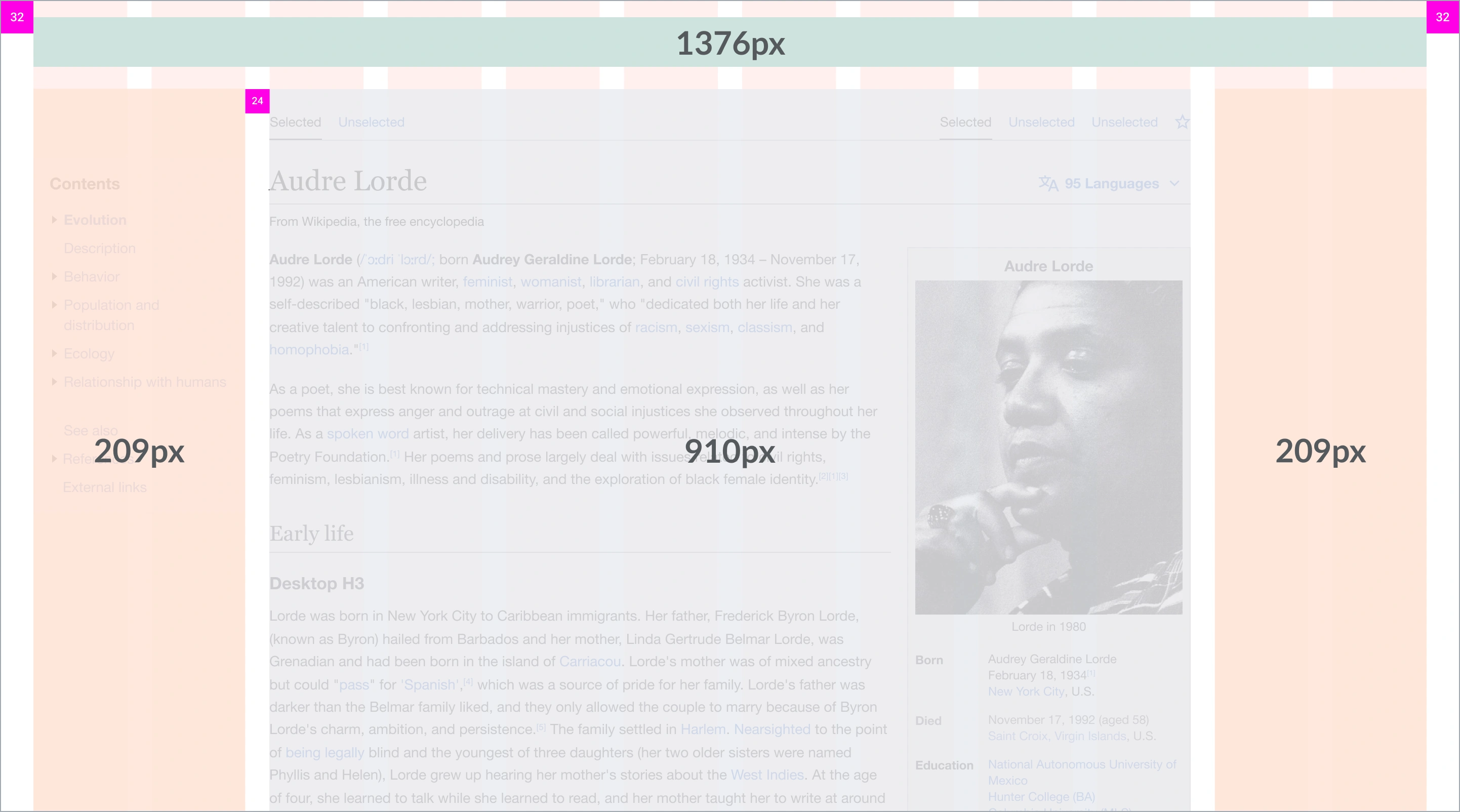
32px margin - 24 px gutter
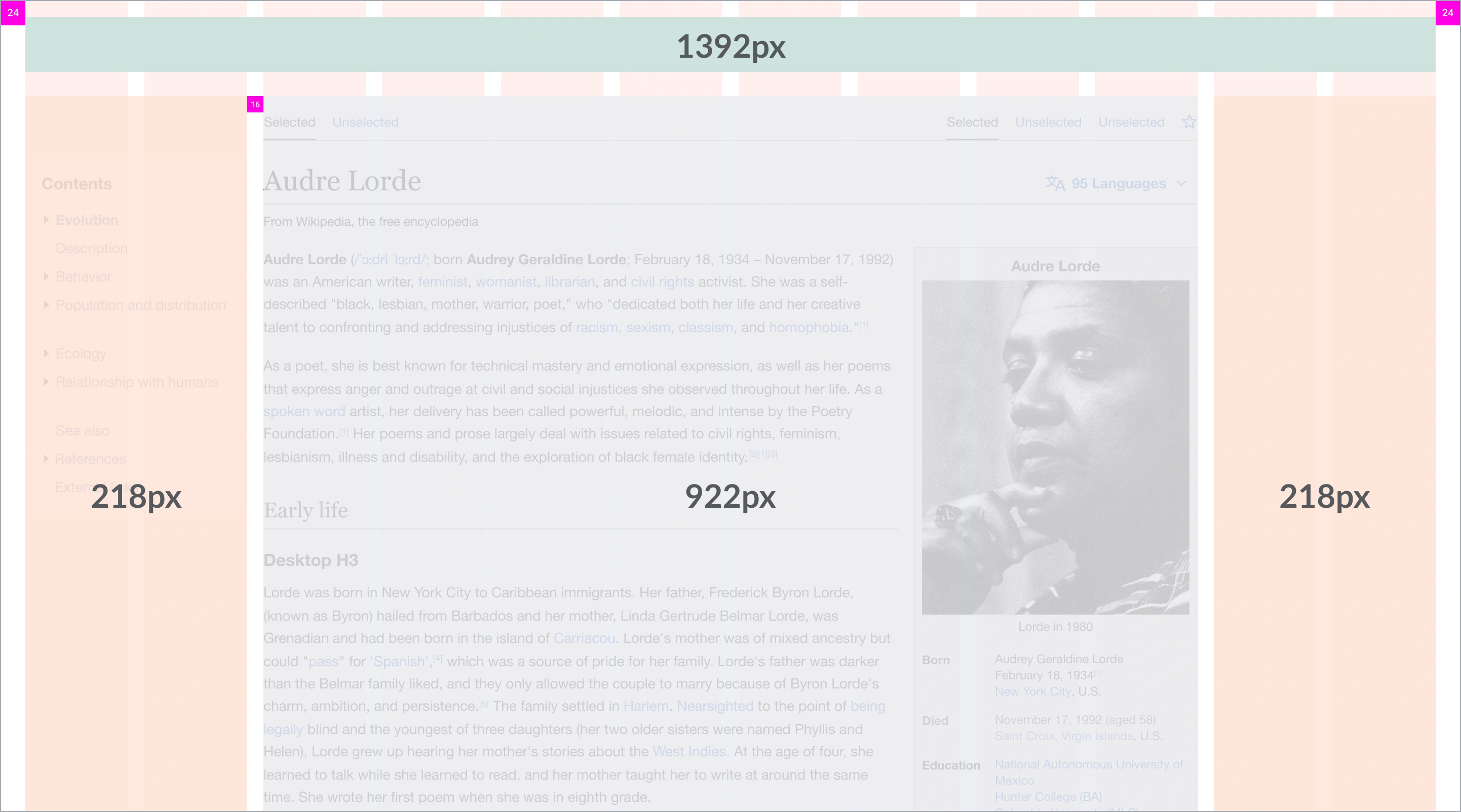
24px margin - 16px gutter
The ToC was too narrow when placed in the first two grid columns (especially on screens below 1280px). This was something we needed to fix since the ToC is really important in our Wikimedia projects.
We tried to expand the width of the right panel from 2 to 3 grid columns. However, this solution did not meet our needs since the ToC went from being too narrow to too wide.
Due to the wide columns of the 12-column grid, the width difference between a 2-column and 3-column ToC was too great.
We couldn’t find the perfect width for the right panel, either it was too narrow (2 columns) or it was too wide (3 columns).
Solution proposed: 24-column grid for desktop
As the 12-column grid was not working for our Wikimedia desktop use cases we decided to find another solution. After some explorations, we decided to use a 24-column grid for desktop instead.
The 24-column grid offers the following benefits:
- The 24-column grid is just twice as many columns as the 12-column grid.
- The combination of columns is greater and allows us more flexibility when deciding the width of the side panels, as well as the central content.
- By combining 24 columns, we have greater flexibility when creating new layouts or updating existing ones.
- Users won’t notice the difference between a 12 or 24-column grid, since the grid columns are not visible to them in the interface. So a 12 or 24-column grid will be perceived as the same visual solution for them.
Testing the new systematic solution
The 24-column grid was tested with different projects and use cases to make sure it would work for both our current real use cases and future possible use cases.
Tested with article content and ToC
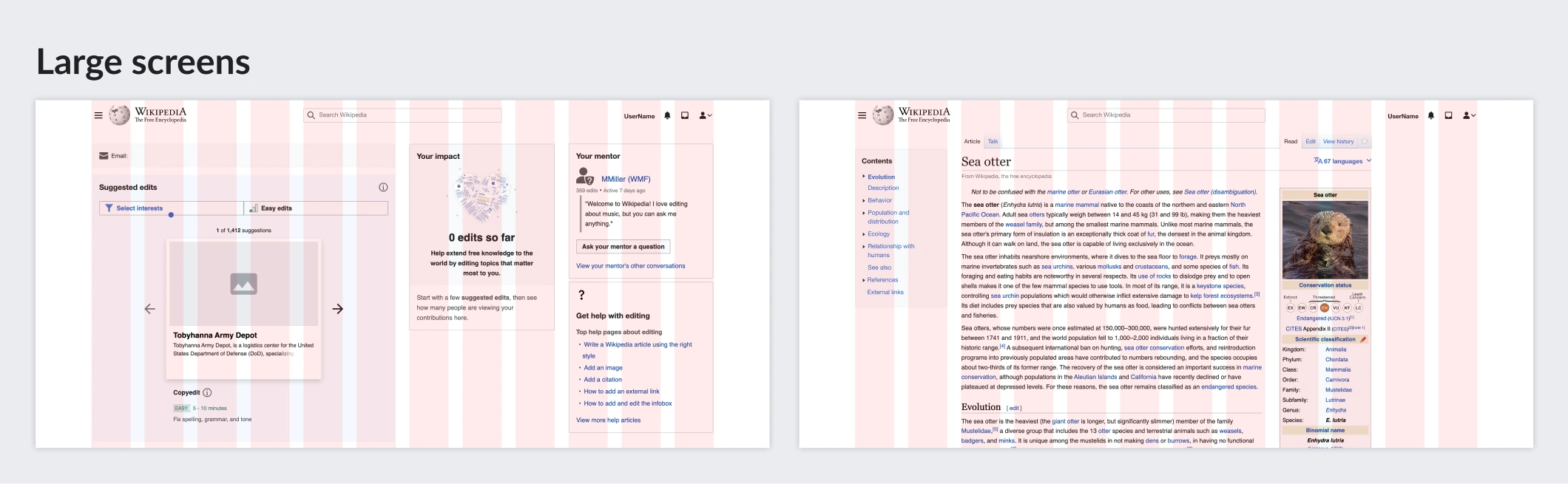
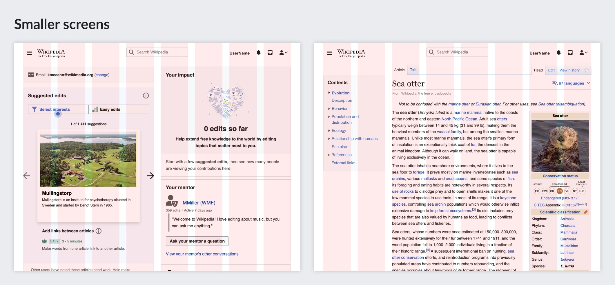
We tested the table of contents and the article content with the 24-column grid in this prototype and they worked perfectly on large, medium, and small desktop sizes.
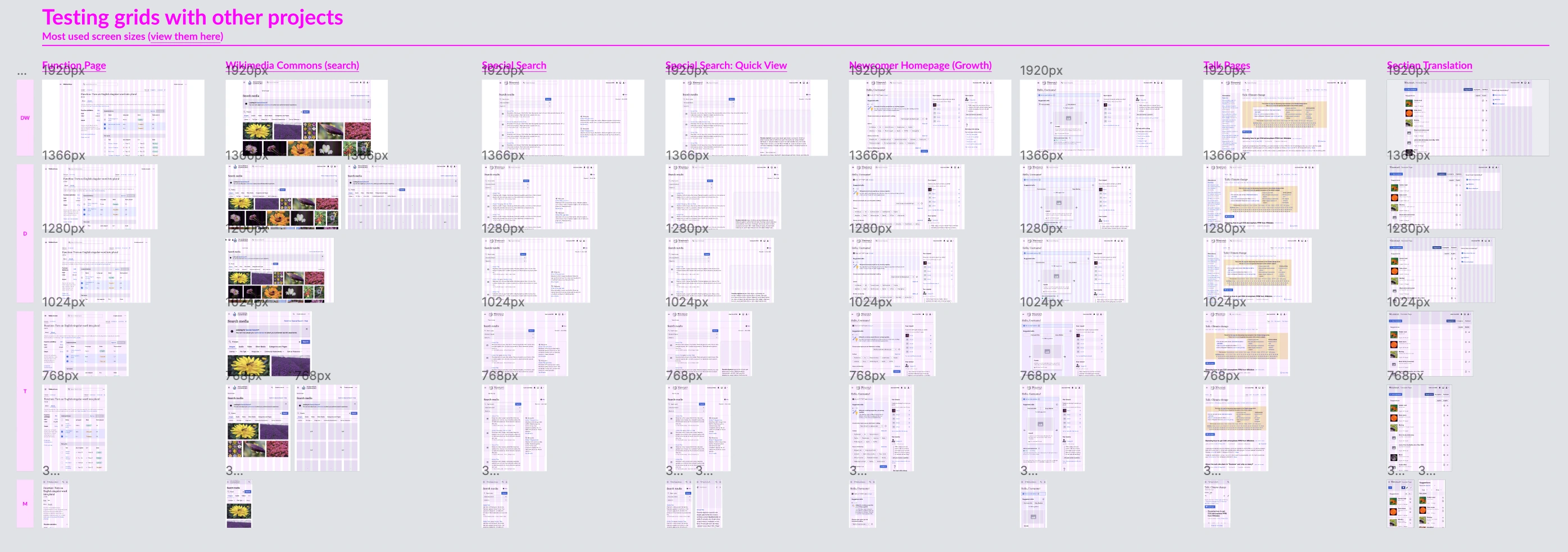
Tested with Wikimedia projects
It was then tested with the most important Wikimedia projects to cover all current use cases.
Tested with different languages
As we work with more than 300 languages, we also tested the 24-column grid with many languages to check if it worked well with different scripts.
Tested with the base font
Our current base font is 14px for desktop. But we also tested the 24-column grid with a base font of 16px in case it changes in the future.
Final grid proposal
After testing this new solution with our different projects and use cases, we determined that the 24-column grid was the best solution. Our final solution was the following.
Desktop Wide
1680px and larger screens
- 24 columns
- Margins: they scale according to the width of the screen
- Gutters 24px
Desktop
1120px - 1679px screens
- 24 columns
- Margins: 32px to max content width, then they scale
- Gutters 24px
Tablet
640px - 1119px screens
- 8 columns
- Margins: 24px
- Gutters: 24px
Mobile
320px - 639px screens
- 4 columns
- Margins – 16px
- Gutters – 16px
In addition to being the most appropriate solution for our desktop projects, the new grid will cover the 3 layouts we are currently using in production. The number of grid columns used varies in each layout and screen size.
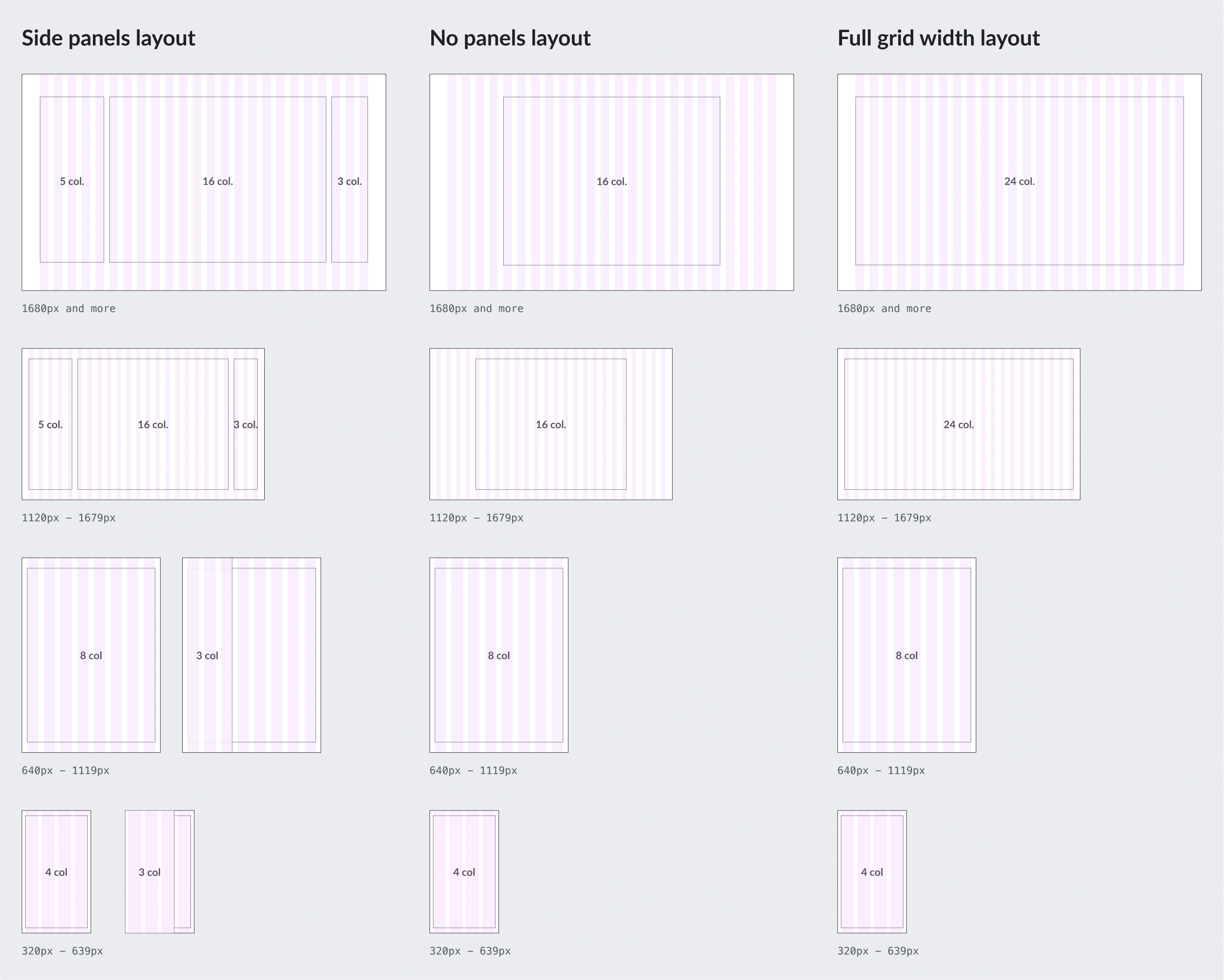
On desktop breakpoints (from 1120px screens onwards), side panels will be visible by default, while on tablet and mobile, they will be hidden. As a result, both the content of the page and the navigational menus will be wide enough for any screen size.
Also, this new grid covers an endless number of design solutions on different screen sizes since the combination of columns is highly variable.
Where will this grid be used?
This new grid will be applied to any new Wikimedia web project. So it will be applied in both Vector 2022 (desktop skin) and Minerva (mobile skin). Due to this new grid system’s exclusive use in new projects, it won’t be used in Vector legacy (desktop legacy skin).
Lessons learned
The most important lesson we learned after designing the new Wikimedia grid was to focus on what really worked for us, and not to worry about what is commonly used on other websites. Although a 12-column grid is one of the most common desktop grids, it didn’t suit our Wikimedia use cases, so we needed to evolve our approach.
It is important to adapt the final solution to what you really need for your project, even if your first iterations are based on lessons learned from something commonly used. Following lessons learned from other projects is worthless if this solution is not the right solution for you.
Get in touch
Thanks for reading! You can read more details about the Design Systems Team and all our current and future initiatives.
Thanks to Alex Hollender, Sarai Sanchez and Volker Eckl for your feedback and collaboration creating the new Wikimedia grid system. Thanks to Lucy Blackwell for the awesome review and feedback on this post.