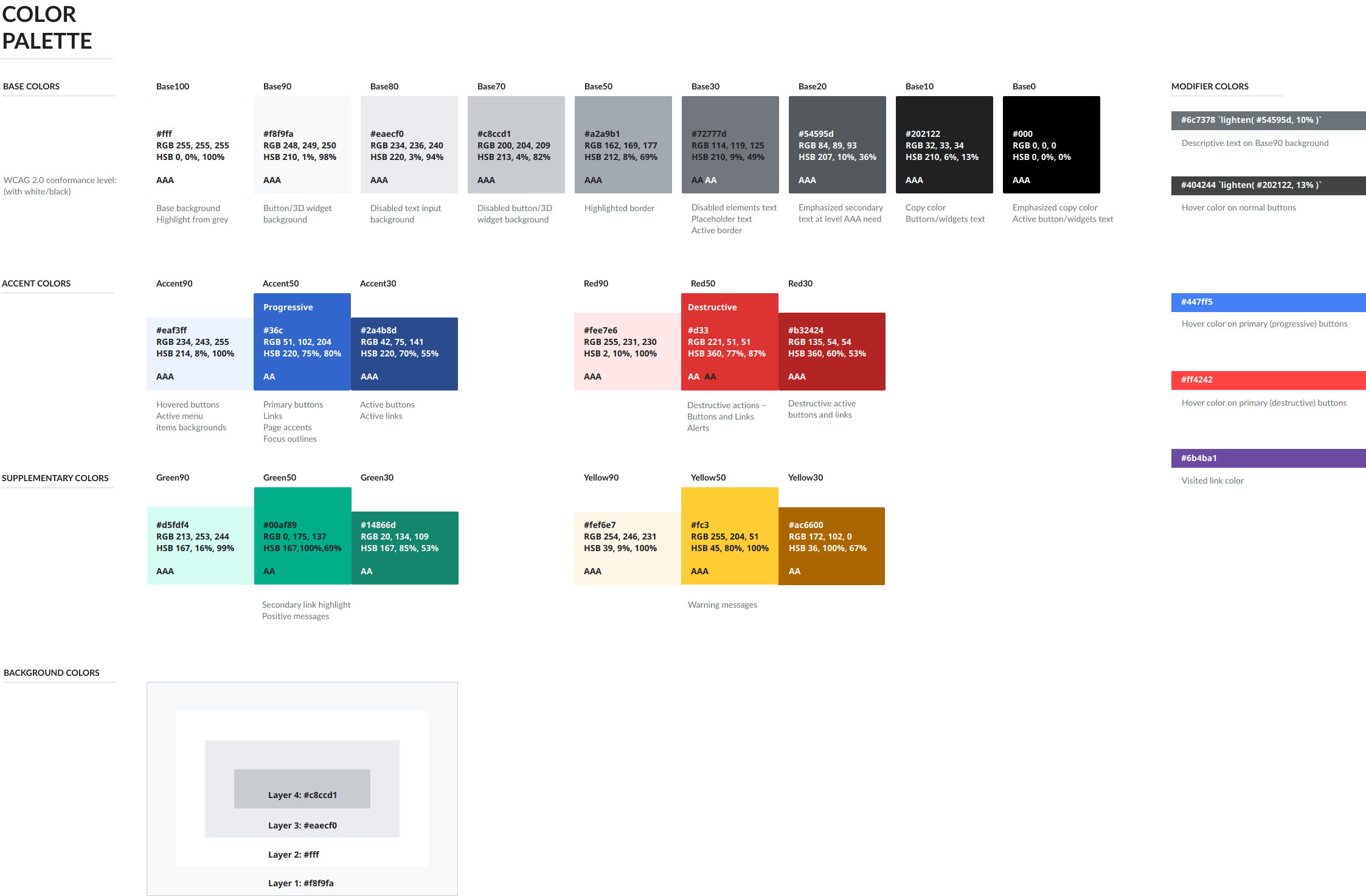
Colors
The color palette represents our character and brings a hint of freshness to our products.
-
Accent90
#eaf3ff -
Accent50
#36c -
Accent10
#2a4b8d
- Base100
- Base90
- Base80
- Base70
- Base50
- Base30
- Base20
- Base10
- Base0
-
Red90
#fee7e6 -
Red50
#d33 -
Red30
#b32424
-
Green90
#d5fdf4 -
Green50
#00af89 -
Green30
#14866d
-
Yellow90
#fef6e7 -
Yellow50
#fc3 -
Yellow30
#ac6600
Because content readability for everyone is our main goal, we have made accessibility considerations a top priority. Each color detailed below indicates its WCAG conformance level (“AA” or “AAA”). This level is based on a color's contrast against white or black.
Base colors
Base colors define the content surface and the main color for content. Different shades of paper and ink are useful to emphasize or de-emphasize different content areas.
Base colors range from pure white (Base100) to true black (Base0). Intermediate shades of gray include a tint of blue for greater harmony with our accent colors.
When applying text on a surface, you need to check the color contrast between the text and the background:
- Base100…50 are safe text colors for a black surface.
- Base30…0 are safe text colors for a white surface.
-
Base100
#fffAAARGB 255, 255, 255HSB 0, 0%, 100% -
Base90
#f8f9faAAARGB 248, 249, 250HSB 210, 1%, 98% -
Base80
#eaecf0AAARGB 234, 236, 240HSB 220, 3%, 94% -
Base70
#c8ccd1AAARGB 200, 204, 209HSB 213, 4%, 82% -
Base50
#a2a9b1AAARGB 162, 169, 177HSB 212, 8%, 69% -
Base30
#72777dAA / AARGB 114, 119, 125HSB 210, 9%, 49% -
Base20
#54595dAAARGB 84, 89, 93HSB 207, 10%, 36% -
Base10
#202122AAARGB 32, 33, 34HSB 210, 6%, 13% -
Base0
#000AAARGB 0, 0, 0HSB 0, 0%, 0%
Accent colors
Accent colors are used to emphasize actions and to highlight key information. Blue is a natural choice in our context, where it has been the default color used for links and conveys the idea of action.
There are three shades provided for when you need a lighter (Accent90), regular (Accent50) or a darker (Accent30) version of blue.
Accent50 is suitable to use for text and as background. When used for link text, this color provides sufficient contrast with black text. When used as background, it provides sufficient contrast with white text.
-
Accent90
#eaf3ffAAARGB 234, 243, 255HSB 214, 8%, 100% -
Accent50
#36cAA ProgressiveRGB 51, 102, 204HSB 220, 75%, 80% -
Accent30
#2a4b8dAAARGB 42, 75, 141HSB 220, 70%, 55%
Utility colors
Utility colors are another type of accent color.
We use shades of red, green, and yellow as utility colors.
-
Red90
#fee7e6AAARGB 255, 231, 230HSB 2, 10%, 100% -
Red50
#d33AA / AA DestructiveRGB 221, 51, 51HSB 360, 77%, 87% -
Red30
#b32424AAARGB 135, 54, 54HSB 360, 60%, 53%
-
Green90
#d5fdf4AAARGB 213, 253, 244HSB 167, 16%, 99% -
Green50
#00af89AARGB 0, 175, 137HSB 167, 100%, 69% -
Green30
#14866dAARGB 20, 134, 109HSB 167, 85%, 53%
-
Yellow90
#fef6e7AAARGB 254, 246, 231HSB 39, 9%, 100% -
Yellow50
#fc3AAARGB 255, 204, 51HSB 45, 80%, 100% -
Yellow30
#ac6600AARGB 172, 102, 0HSB 36, 100%, 67%
Common meanings are associated with them:
- Variants of red indicate errors in components, such as invalid text in a text field. They also represent destructive actions, such as delete or cancel.
- Variants of green indicate success in components.
- Variants of yellow indicate a non-disruptive warning or an alert.
When indicating meaning to visually impaired users, not only rely on a color, but use additionally clear wording and icons.
Additional colors
Some use cases, such as charts and data visualization, may need a broader color palette. Aim for level AA contrast (4.5:1) when extending the default palette. Make sure to test how these colors are perceived at different color vision deficiency conditions.[1]
Resources
Find the color palette in WikimediaUI Icons and Colors Figma file.
Alternatively, the color palette is available as SVG and PNG download from 'resources' directory of this Design Style Guide repository.
References
- See also English Wikipedia on accessible color usage as part of its Manual of Style.